In the B2C world, there are countless examples of word-of-mouth and user referrals being significant drivers of growth. However, in B2B, the power of user referrals hasn’t been fully realized, despite being a highly sought-after source of growth. In this article, we will explore existing B2B referral program examples, analyzing their operational elements to identify effective strategies and areas for improvement. You will hopefully walk away inspired and better educated when setting up your next referral program.
Let's start by examining what are fundamental building blocks each successful SaaS referral program needs to have.
Introduction to B2B referral program examples
Can B2B referrals work for you?
One of the primary reasons why not all B2B referral programs achieve their goals is the nature of the product itself. To determine if word-of-mouth will drive growth for B2B SaaS tools, certain indicators are essential to consider:
Your customers are already advocating for new customers
The growth in customer referrals serves as a testament to the quality of your product. It is crucial to have users who are deeply passionate about the problem your product solves. If your users lack the willingness and ability to share your product with others, no amount of incentives can address this underlying issue.
Your users need to have a network to tap into
While certain B2B products can be easily referred, many others are more specialized and require greater effort from the user. By implementing appropriate incentives, you can reduce this friction and motivate your users to extend their reach beyond their immediate network, thus promoting your product effectively.
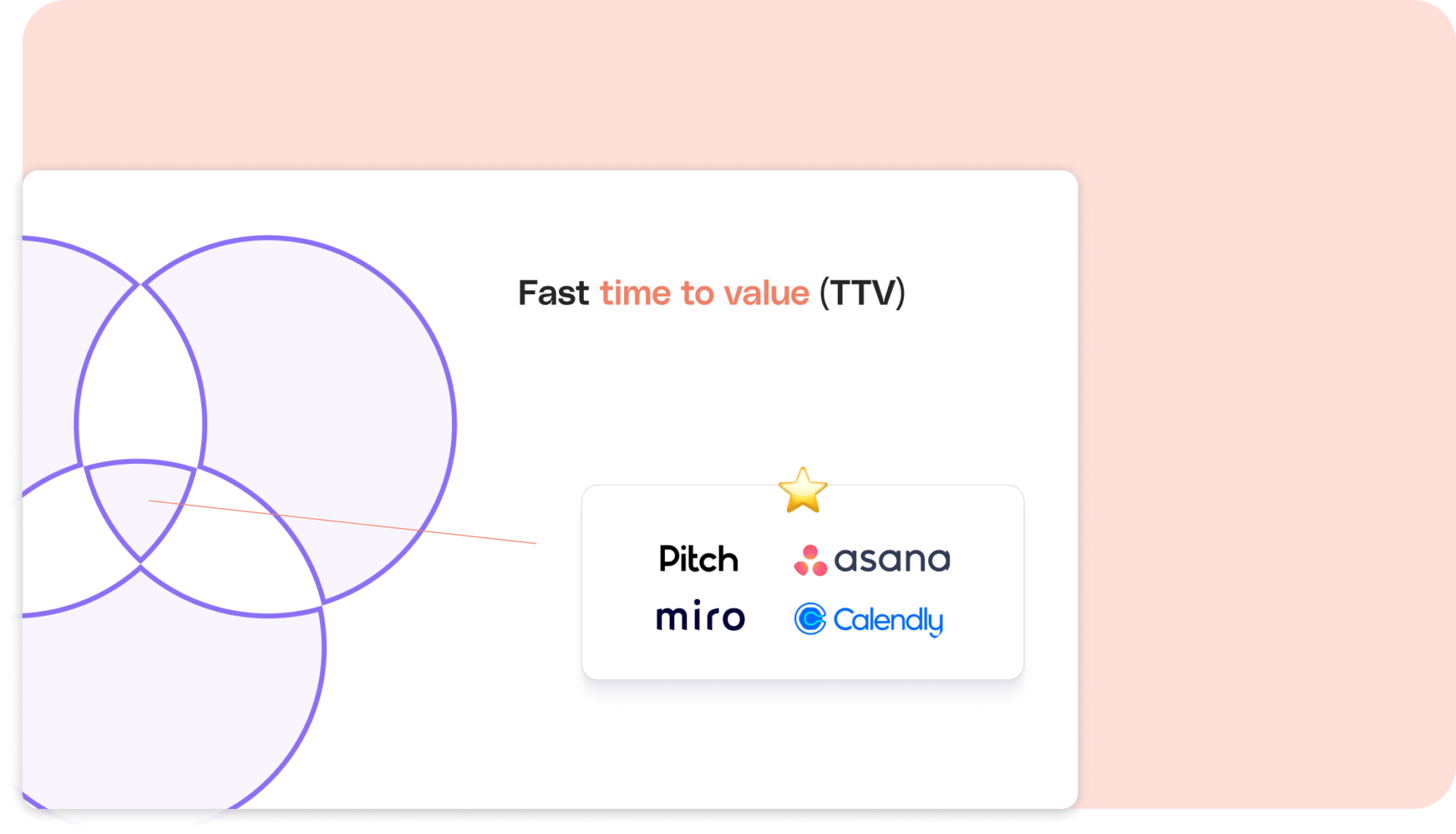
You can position your company within the Referral Potential Venn diagram
Apart from the aforementioned essential factors, there are three additional dimensions to consider. The top performers excel in all three areas, but it is still possible to achieve success by focusing on just two. Anything outside these optimal ranges is considered the "B2B referral death valley."
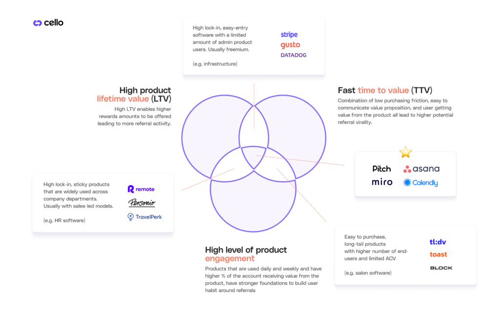
High product lifetime value (LTV)
Higher rewards can be set with this approach (e.g. through high ACVs) leading to a potentially higher referrer engagement. A potential downside might be that it results in a reduced number of potential new users within the referrer's network.
Fast time to (product) value (TTV)
Streamlined onboarding processes, easy-to-communicate value proposition and quick results create a low-friction way for potential new users to experience the value of the product or service. This will result in building faster referral habit formations since referrers might gain their rewards faster.
High level of product engagement
Aiming for a high number of daily users across the entire company will maximize referral potential. Engaged customers become enthusiastic advocates, driving more referrals.
B2B referral program best practices
User journey integration
A successful user journey integration strategy for a referral program relies on two key factors: embeddedness in the user flow, and multiple touchpoints to the program across channels.
Embeddedness in the user flow: A best-in-class referral program seamlessly integrates into the customer's journey. By embedding it within the product or service, it is ensured that customers encounter referral opportunities at the most relevant moments. This integration enhances user experience and increases the likelihood of referral participation.
Multiple touchpoints across channels: To maximize the visibility of the referral program, a referral program is promoted at multiple touchpoints, including email, social media, website, and product pages.
Context specific promotion: By targeting users at moments when they are most primed for sharing, such as after giving a Net Promoter Score (NPS) above 8, the company ensures that the referral prompts are presented when customers are most likely to refer others. This strategic approach increases the effectiveness and conversion rates of the referral program.
B2B Rewards
A well-designed rewards system adjusted to the product’s value proposition is crucial for the success of a referral program, as it serves as a powerful motivator for customers to participate. The following factors should be considered:
Attractive incentives: The incentives offered should be compelling enough to motivate customers to refer others. These incentives should be ideally of monetary nature, but could also be in-product rewards, vouchers or donations. The rewards should align with the value customers derive from the product and should be two-sided, e.g. both the referrer and the referee benefit from the program.
Timely and transparent reward fulfillment: When customers refer others, they expect prompt and transparent reward fulfillment. An effective referral program ensures that rewards are delivered in a timely manner and communication about the reward status is clear.
Gamification through easy and clear tracking and reporting mechanisms: Effective referral programs incorporate robust tracking and reporting mechanisms. This enables referrers to keep track of and trace shared referrals and drives engagement.
Ease-of-use & messaging
B2B referral program's success rates are highly affected by how easy and effortless it is for the referrer to share the product with friends and peers. The following criteria are crucial for effective B2B referral program examples:
Ease-of-use and simplicity: A well-designed referral program is intuitive and straightforward. Top-edge referral programs offer a user-friendly process that allows customers to effortlessly refer their contacts, track their referrals, and redeem rewards. By eliminating complexity, participation rates increase and maximize the program's effectiveness.
Effortless sharing: Sharing a referral program should be easy and seamless. With multiple sharing options (e.g. LinkedIn, Twitter, Mail) customers can effortlessly spread the word about their SaaS offering. This frictionless experience encourages active participation and increases the likelihood of successful referrals.
Personalized and appealing messaging: The messaging of the referral program is key to engaging the target audience. Crafting personalized and compelling messages that resonate with the users will help engage referrers. By aligning the messaging with users’ needs, preferences, and pain points, the program will drive higher engagement and encourage more referrals.
Clear and understandable terms: Transparency is essential in building trust and ensuring customer satisfaction. The referral program terms and conditions should be easy to understand.
B2B referral program evaluations
Now that we have outlined some best practices, it is time to take a closer look at several B2B referral program examples and evaluate how they score in the different categories. Let's dive in.

The above table provides an overview of the evaluation of 11 different B2B referral program examples. We will dive into more details afterwards. Since each referral program is unique and crafted to match customers' targeted groups, our assessment is based solely on our experience setting up successful B2B referral programs.
Airtable
Airtable is a platform that enables businesses to streamline workflows and improve collaboration through customizable low-code solutions, resulting in impressive achievements.

How it works
To participate in the referral program, a referrer needs to be a freemium user of Airtable.
What we like
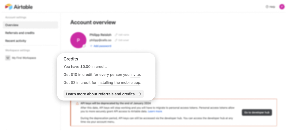
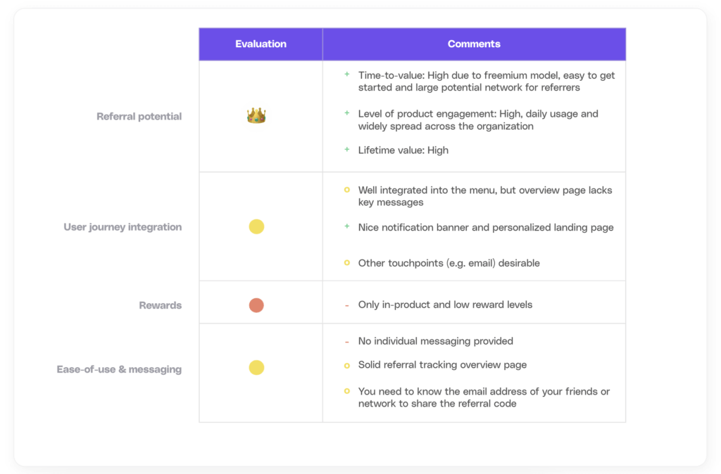
The Airtable B2B referral program is well-designed with a clear and comprehensive overview page that explains how the program works and what rewards customers can expect.
What stands out is the notification banner at the very top of the page, making the user aware of the referral feature, leading to a higher activation rate.
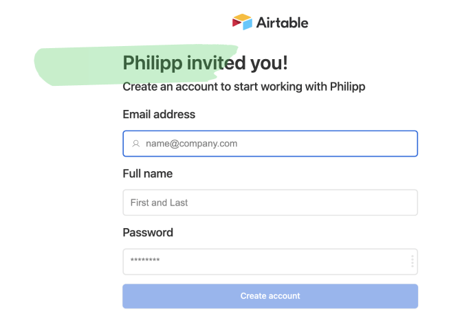
Besides, the sign-up page is also highly personalized, making it easy for customers to join and get started. Additionally, Airtable provides multiple touchpoints for customers to refer to their peers, including menu and co-worker invitation options.
What could be improved
Although the Airtable referral program successfully offers in-product rewards, its reward level is relatively low and does not encourage ongoing or continuous referral behaviour. Simply providing $10 credits per verified sign-up might be insufficient to sustain lasting interest or incentivize ongoing referral activity.
Moreover, the program is limited to only one sharing option (email), thus restricting its full potential reach. It might be beneficial to have a more comprehensive overview page, including tracking status to assess referral outcomes.
Evaluation
Canva
The next B2B referral program example we want to shed light on is Canva. Canva is a popular online graphic design tool that allows users to create designs for various purposes such as social media, marketing, and presentations.
How it works
To participate in the referral program, a referrer needs to create a free account and can access the program from the drop down menu.

What we like
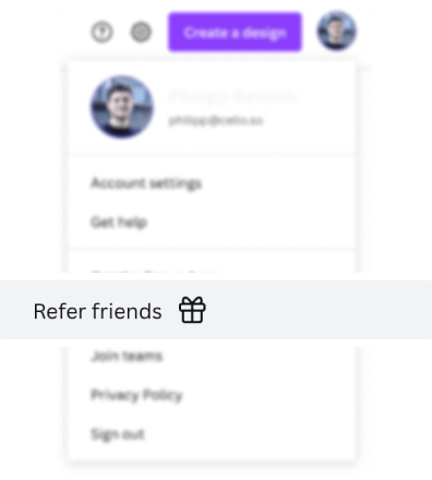
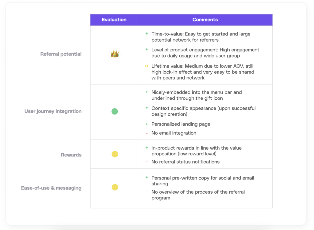
The program is promoted with a gift icon, which allows users to easily locate it. Furthermore, the referral program widget often appears immediately after a user has exported a finished design, leveraging moments of user happiness where they may want to spread the word to friends.
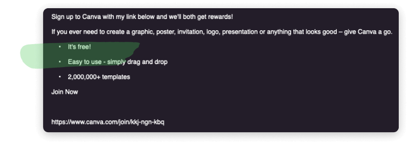
The referrer has multiple sharing options (e.g. Facebook, Twitter, email). Also, the pre-written email copy is concise, understandable, and personalized.
What could be improved
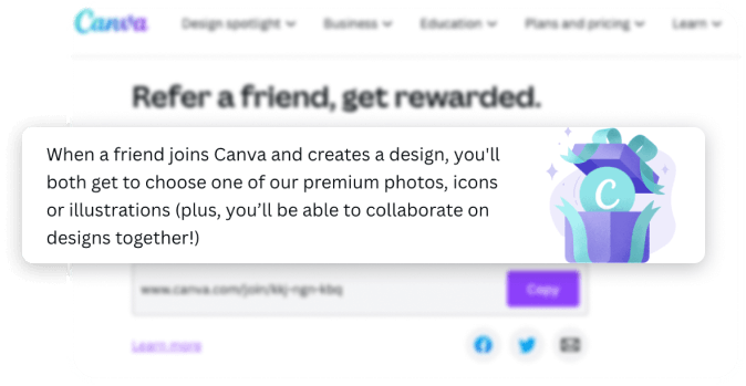
The availability of solely in-product rewards could be perceived as a disadvantage. Yet, in light of Canva's value proposition and the fact that it is used for both private and business purposes, such rewards may be appreciated by some users. It might be advantageous to provide a choice between in-product and private monetary payouts.
Another aspect to enhance is the level of sophistication of the referral page, particularly in terms of tracking the status of referrals.
Evaluation
Cord
Cord is a sourcing platform for tech talents.
How it works
To participate in the Cord referral program, a referrer needs to be a paying user of Cord. After logging in, a referrer can access the program through the sidebar.

What we like
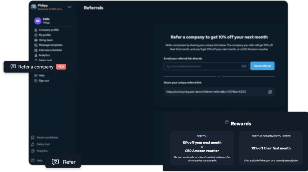
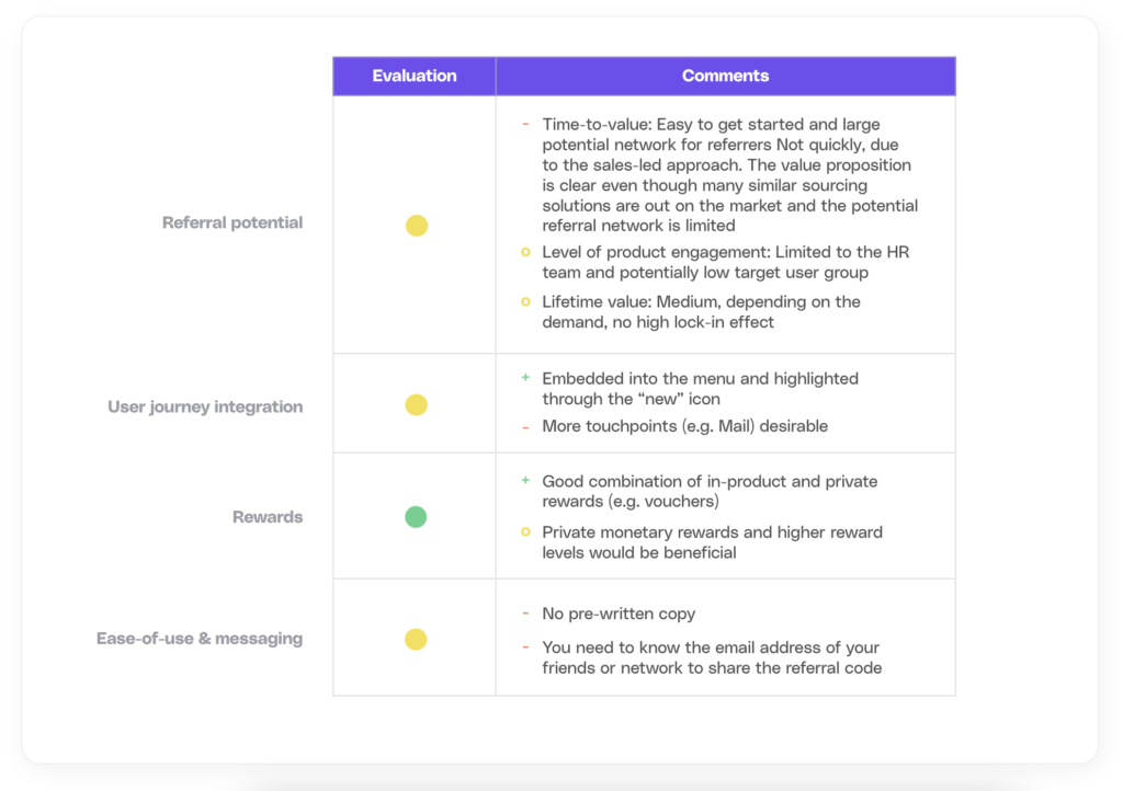
Cord's referral program is great in terms of user accessibility. It is prominently displayed in the sidebar and footer for ease of use. With the "new" icon in place, users know that there is an exciting new feature they can access.
The referral program also provides a comprehensive overview of the rewards available to both those who refer and the people they refer. The graphical display effortlessly separates the reward types and highlights the key terms and conditions for a successful referral.
Toward the bottom of the page, there is a succinct three-step guide to streamline the referral process, alongside a well-structured Terms & Conditions page.
What could be improved
By offering more diverse reward options (e.g. private monetary payouts) and adding more sharing options (e.g. social), Cord could make its referral program more accessible and attractive to a wider group of users.
It is only possible to manually add email addresses and no pre-written copy is available, creating an extra burden for referrers.
Evaluation
Doppler
Doppler is a platform to sync, manage, orchestrate, and rotate secrets across any environment or app config with easy to use tools.
How it works
A referrer needs to create an account to participate in the referral program and can access the referral link from within the platform.

What we like
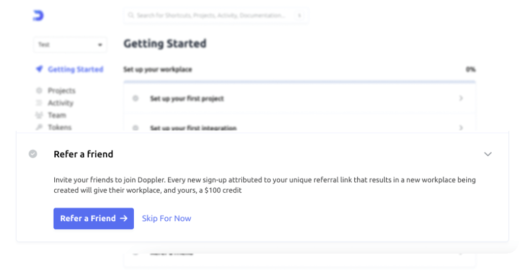
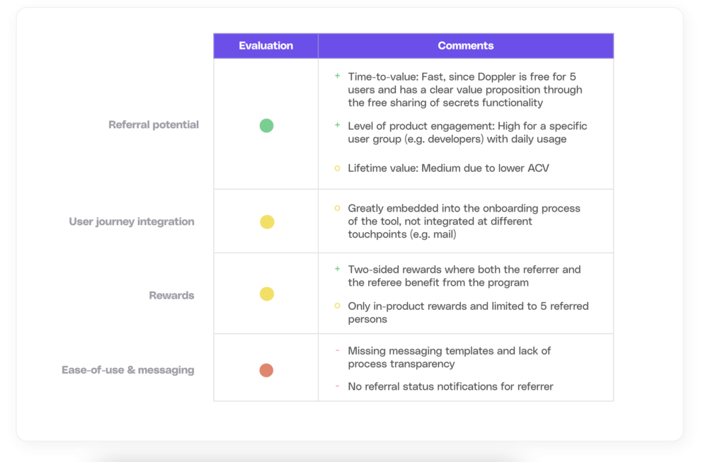
One of the strengths of Doppler's referral program is that it is part of the onboarding experience and constantly visible in the sidebar of the tool, creating awareness of the program. This makes it easier for customers to participate in the referral program and refer Doppler to their peers and friends.
The FAQ focuses on the most relevant areas (e.g. payout process, qualification criteria).
What could be improved
The program rewards referrers solely with in-product rewards, which may provide less incentive than personal, monetary rewards.
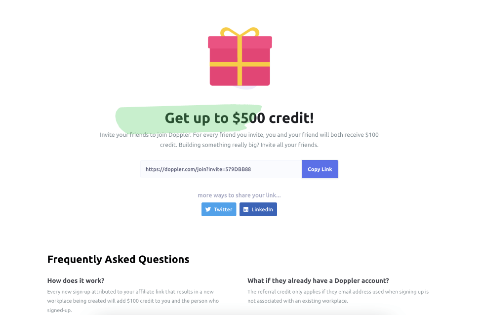
Additionally, the limit of five referrals per referrer may not allow full leverage of the program's potential.
The absence of a portal monitoring the referrals, combined with the need for more sharing options, further highlights some areas for improvement.
Evaluation
Expensify
Expensify is a tool designed to simplify the process of tracking business expenses. The tool allows users to scan receipts, track time, and create reports that can be easily shared with employers or clients.
How it works
To participate in the referral program, referrers need to be an Expensify member, having opted in for the newsletter to receive a unique referral link or accessing the mobile app to get an invite to a referral link.

What we like
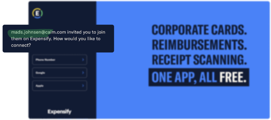
Expensify implemented some effective tactics for leveraging B2B SaaS growth in their referral program. The referral link includes the referrer's name, building trust and fostering a personal connection. Moreover, the landing page features a clear value proposition and structured layout that helps users understand the product in seconds.
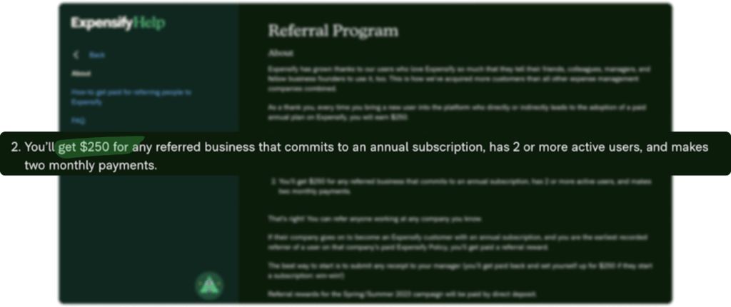
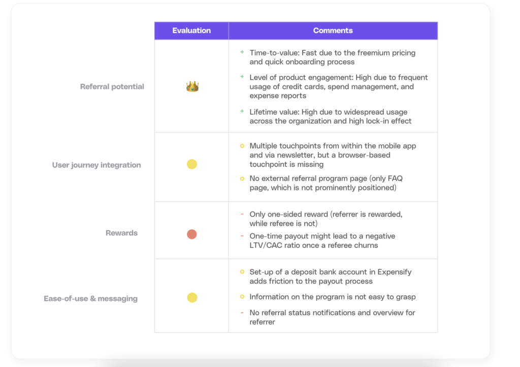
Expensify also provides a detailed FAQ section about their referral program, addressing critical queries and engaging users through multiple touchpoints: Customers can learn about the referral program through personalized email campaigns or directly from the mobile app, but it is not currently accessible via the browser-based platform.
What could be improved
The referral program's current one-time payout could negatively impact the LTV/CAC ratio if newly acquired customers churn. Consideration could be given to implementing a minimum time requirement or adopting a recurring rewarding model to re-engage referrers.
Improving the structure, length and presentation of the FAQs and emails could enhance user-friendliness. Focusing on key messages and incorporating visual aids, such as graphics or step-by-step guides, can make them easier to understand and follow for a smoother user experience. An additional downside is that the program is currently only accessible through mails and Expensify’s mobile app.
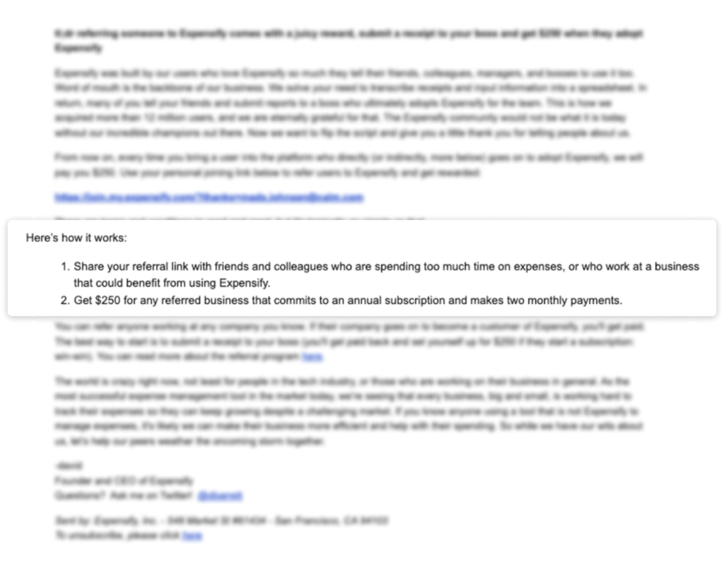
The referee does not currently benefit from the referral program. One-sided rewards may reduce the conversion rate from free to paid customers and negatively impact the success of the growth motion.
Evaluation
Folk
Folk is a lightweight, customizable CRM powered through AI.
How it works
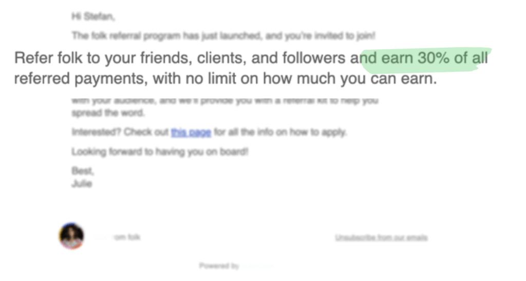
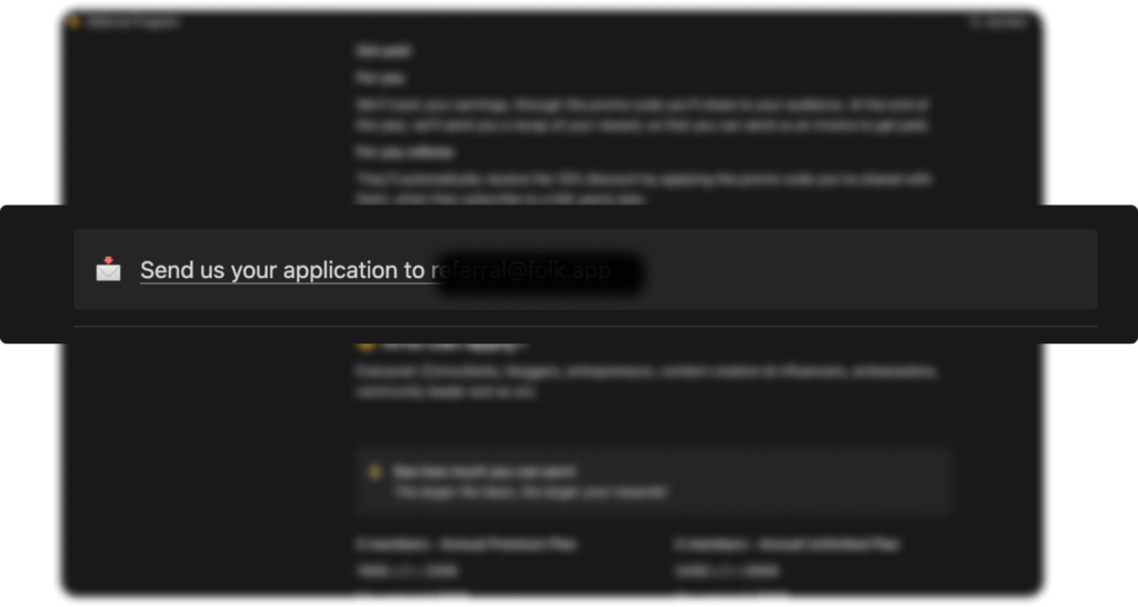
Users of Folk are informed via email of the referral program and can apply to become a referrer. Upon successful approval, a referrer will receive the referral link. A referrer can also apply as a non-user.

What we like
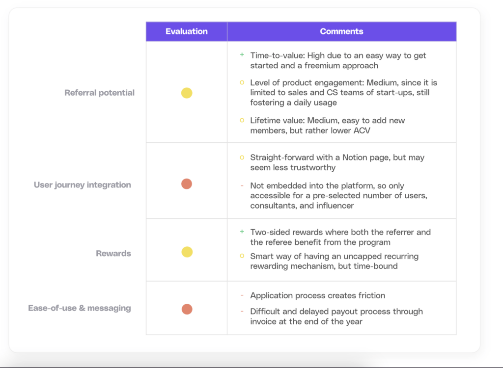
What we like is the uncapped recurring reward model, which is bound to a minimum time of 12 months, ensuring a long-term payout and monthly activation of the referrer. A downside of this is that it is difficult for the referrer to grasp how much money he or she can earn over time.
Folk also supports the referrer in spreading the word. Upon successful registration, a referrer will receive different assets (visuals, copy etc.) to share Folk with friends and the referrer’s network.
What could be improved
One potential drawback of the referral program is that users need to apply to participate, and while the Notion page is a fast way to get started, it may not generate high levels of trust.
The strategy of offering an uncapped referral reward for the first 12 months could be affected by the unclear and slow rewarding process, which requires submission of an invoice to Folk at the end of the year, creating an additional burden and potentially reducing the referrer's motivation.
Evaluation
Growbots (Powered by Cello)
Growbots is an AI-powered outbound sales platform.
How it works
To participate in the referral program, a referrer needs to have a free trial account for Growbots.
What we like
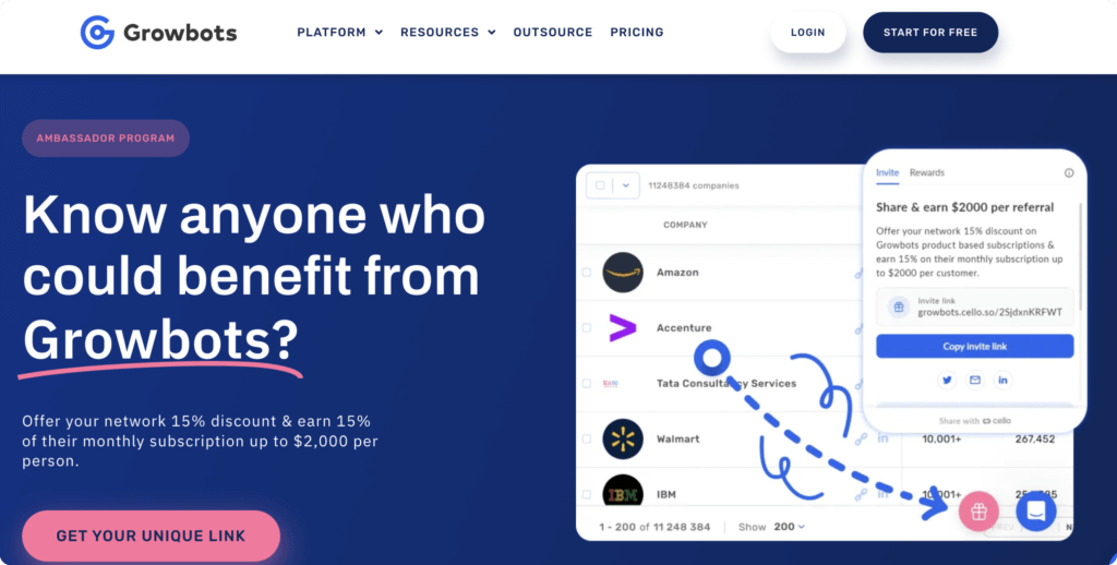
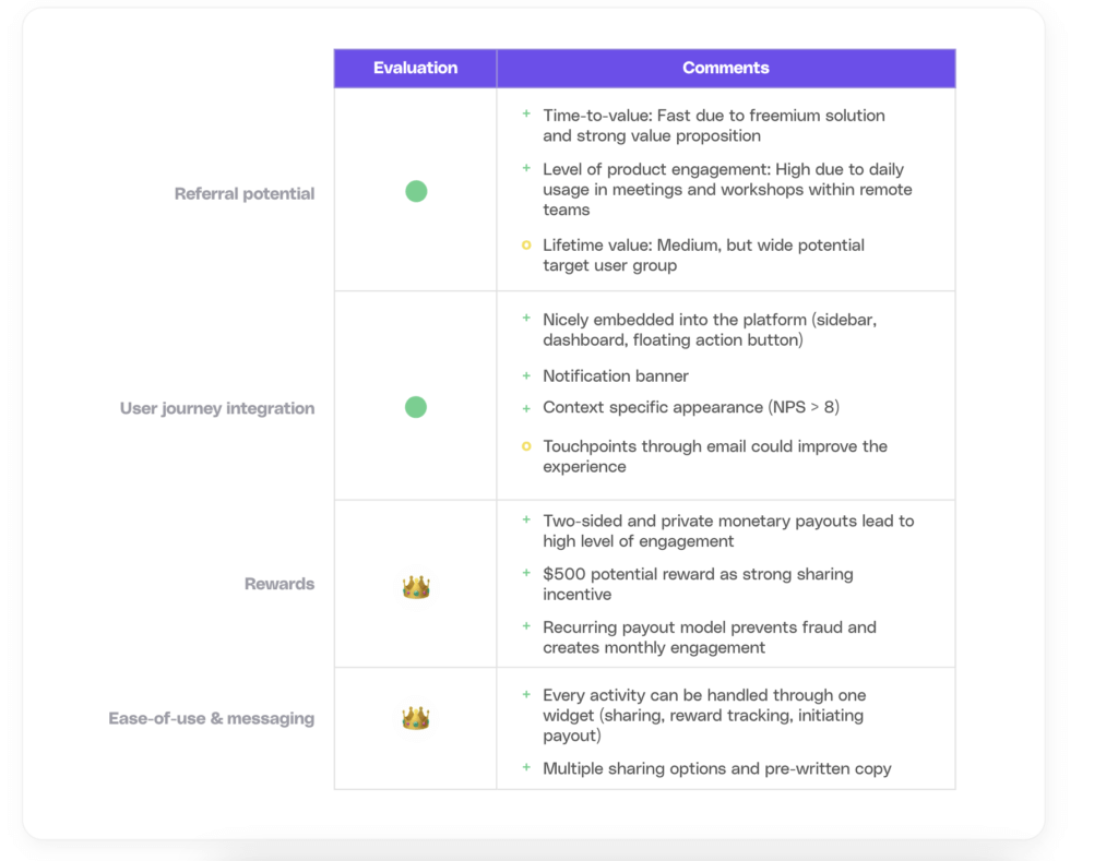
Growbots' referral program excels in seamlessly integrating into the portal. Throughout the user journey, the program is introduced in a casual, yet purposeful manner. Already providing an insightful overview on their website, the portal follows suit with excellent positioning for the user's convenience.
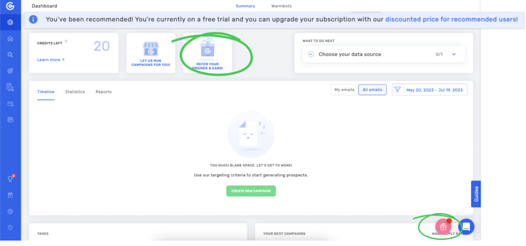
Upon a successful sign-up, referrers can access the program from various placement locations. This includes prominent placement at the top or via the floating action button. Upon first sign-up, the user is notified through a banner placed beside the floating action button on the program, while referees are informed of discount offers through a banner positioned at the top of the page. The referral program widget itself is equipped with an onboarding guide that details the program specifics upon initial use.
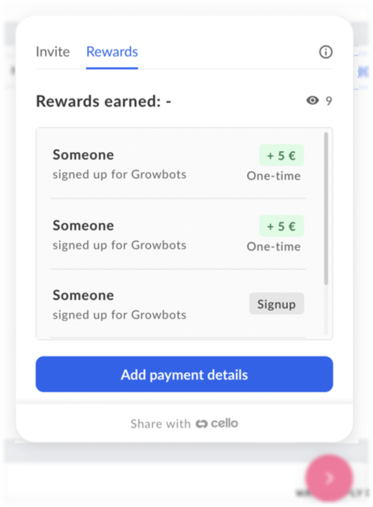
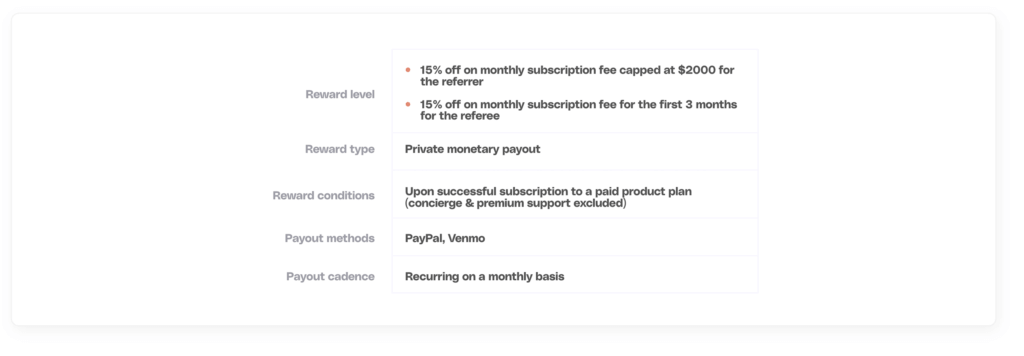
One effective tactic is to integrate the FAQ into the widget. With a click on the information icon, critical questions are answered. Another tab provides the referrer with updates on collected rewards (e.g., sign-ups, transactions). The recurring reward model is particularly appealing here because it deters fraud and keeps the referrer engaged on a monthly basis, creating an engagement loop. The payout process is streamlined through either PayPal or Venmo.
What could be improved
Providing more payout options such as Apple Pay and WeChat Pay can broaden the target audience of a program. While the program is well integrated into the portal, notifying referrers about it through email could increase their engagement even further.
Evaluation
Moss
Moss is a leading corporate card and spend management solution, which seamlessly integrates into your existing systems.
How it works
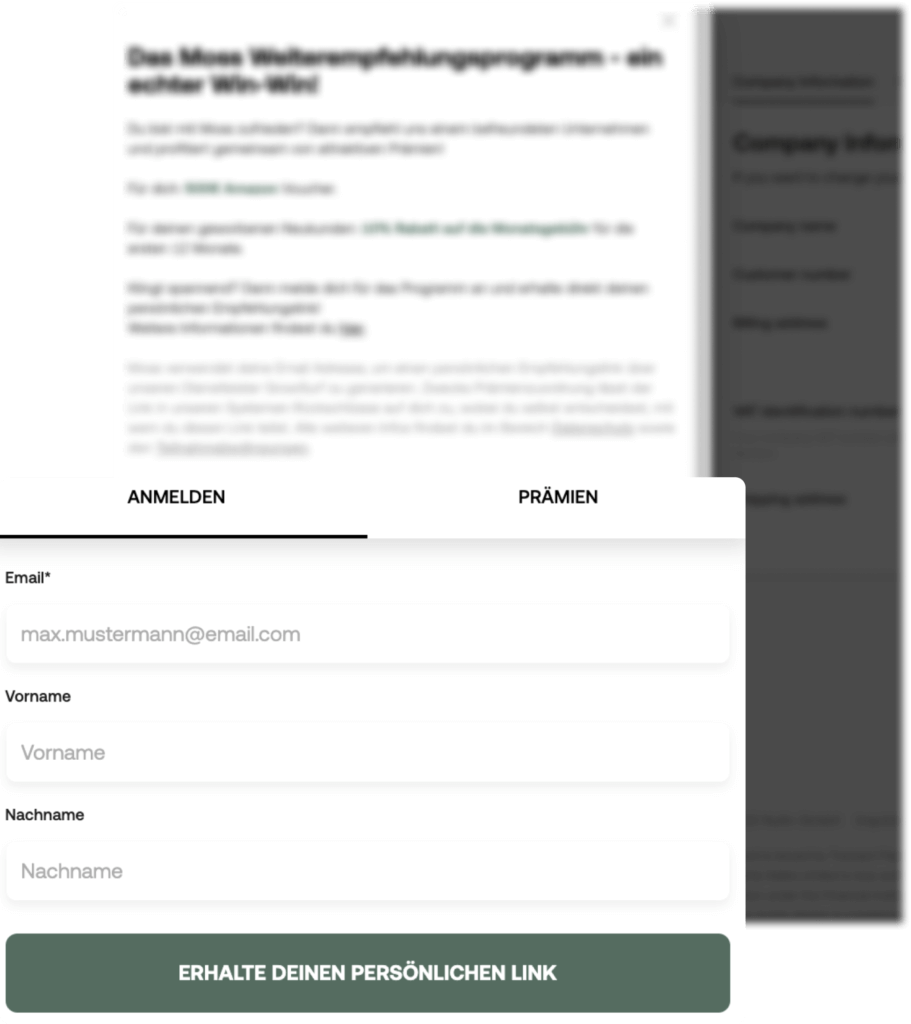
To participate in the SaaS referral program a referrer needs to have a paying account at Moss. The referral code is accessible from within the platform, but requires another registration.

What we like
The referral program is two-sided, meaning that not only does the referrer receive a reward but also the referee receives a discount. Moss also provides pre-written emails to make it easier for users to share the referral link with their friends.
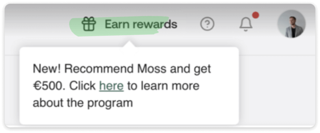
The notification banner displayed upon logging in can play a critical role in promoting a new referral program, driving higher activation rates. The banner's persuasive language emphasizes the opportunity to earn 500€ by referring others, offering an enticing hook. Additionally, the program is prominently positioned, as a gift icon appears next to the profile icon, eliminating the chance of users overlooking it in a drop-down menu.
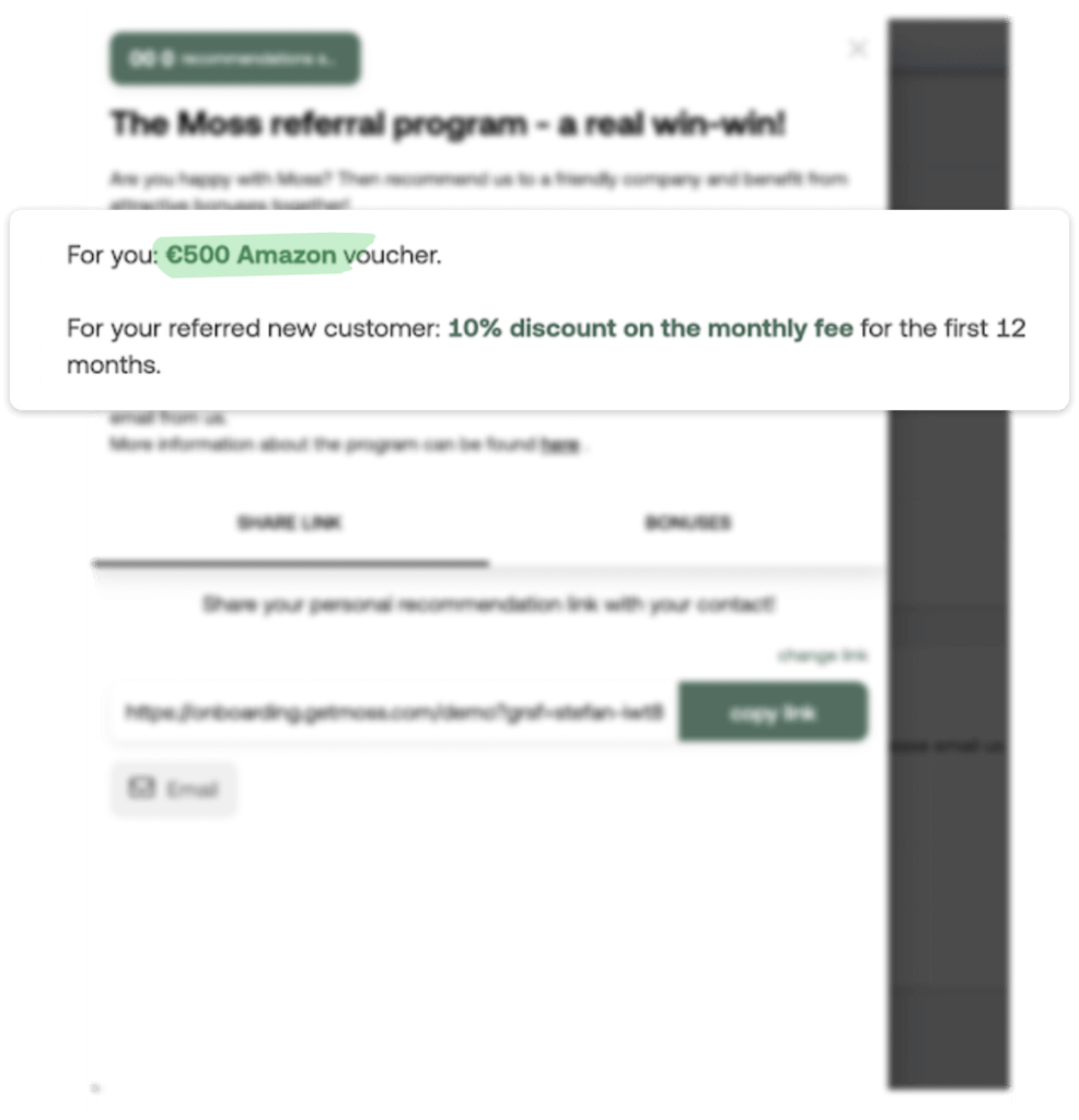
The notification banner displayed upon logging in can play a critical role in promoting a new referral program, driving higher activation rates. The banner's persuasive language emphasizes the opportunity to earn 500€ by referring others, offering an enticing hook. Additionally, the program is prominently positioned, as a gift icon appears next to the profile icon, eliminating the chance of users overlooking it in a drop-down menu.
What could be improved
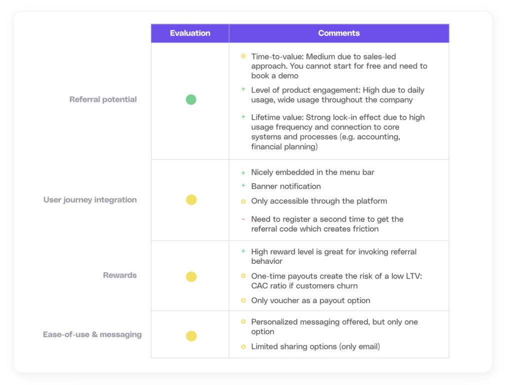
While the 500€ reward for driving referrer's engagement is highly appreciated, it does have some drawbacks. The referral program's effectiveness may be influenced by the negative LTV/CAC ratio whenever newly referred customers churn. Additionally, sharing options are currently limited to email, and referrers have no way of tracking their referral's status or reward.Another potential downside is the fact that you have to log in a second time to get the referral link, which creates extra friction before getting started. These elements can reduce the effectiveness of the referral program, as they may make it less attractive to users who are looking for a quick and easy way to participate in the program.
You can only have 5 successful referrals per year (you would need to upgrade to a partner program afterward). While the terms and conditions are easy to understand, they do not create trust, being just a simple PDF 1-pager.
Evaluation
Pipedrive
Pipedrive is a popular CRM software for customer success and sales teams.
How it works
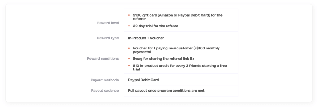
To participate in Pipedrive’s referral program, referrers need to be a paying Pipedrive customer to access the program from within the platform (e.g. drop-out menu).
What we like
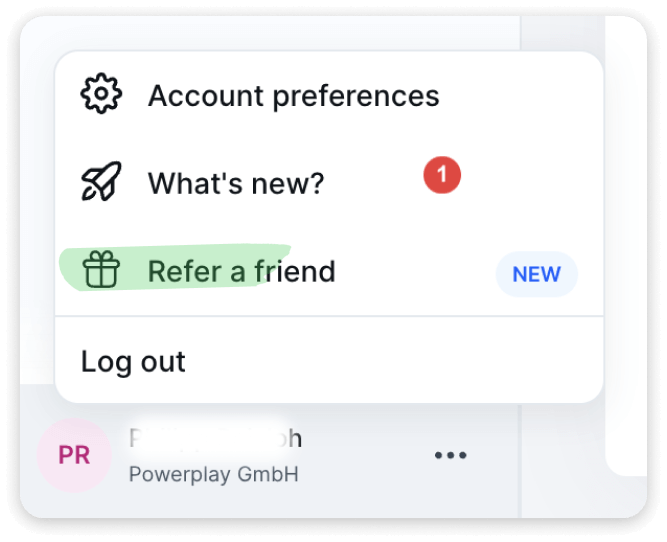
The referral program can be found on two different locations on the platform. Our experience shows that the more visible a program is in the product and along the user journey — for instance, through a floating action button — the higher the activation rate. Therefore, having two activation areas (in the drop-down menu and sidebar) is a good start.
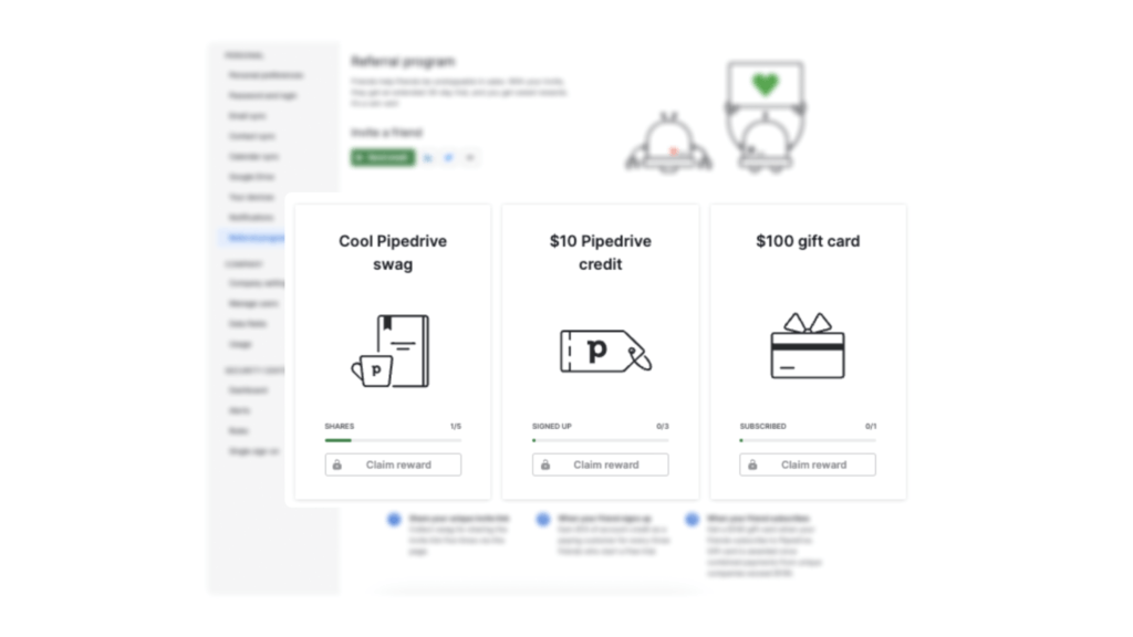
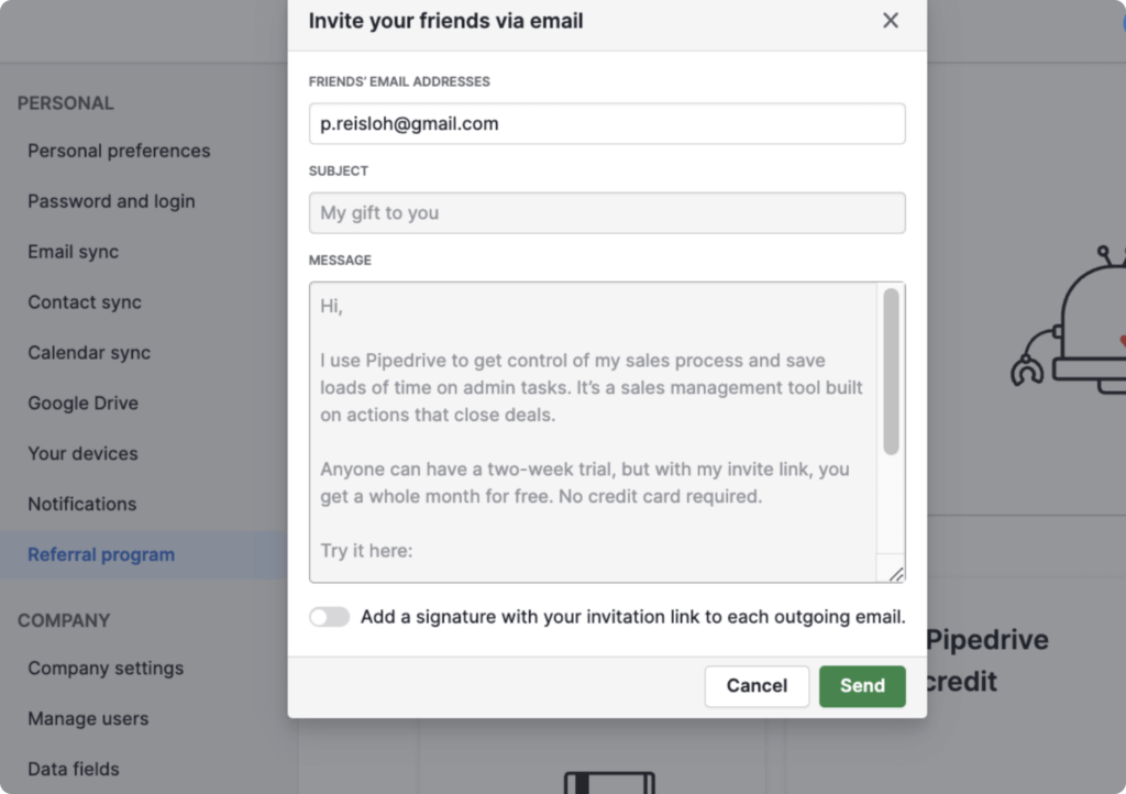
Overall, Pipedrive's referral program has a simple and well-structured overview page, including different reward options, the process of the referral program, and the status of referrals, making it easy for users to understand how it works. Additionally, the program offers a pre-written copy for sharing the link with friends, which can save time for users who might have difficulties promoting Pipedrive.
What could be improved
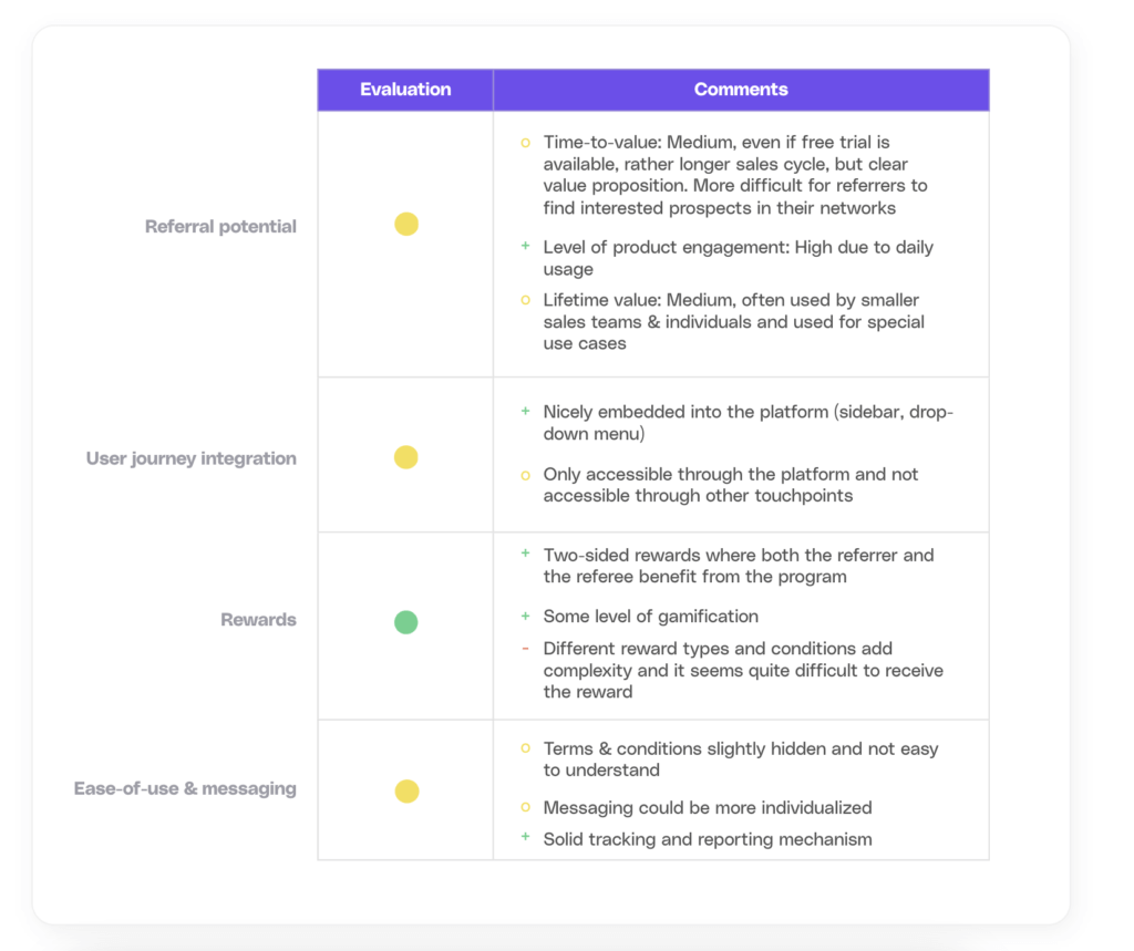
Offering different reward types for referrers, along with low-entry reward conditions, such as swag for sharing the link five times, is generally a good idea. However, it is essential to ensure that the required conditions do not burden the referrer. Some users might perceive the proposed reward to be disproportionately low, relative to the effort required to generate a referral. Therefore, it is desirable to offer more compelling and personally relevant rewards, such as monetary incentives, to ensure greater engagement from referrers. The magnitude of the reward should be in line with higher values of LTV and ACV.
Besides, it can be advantageous to provide an overview of the referral status, outlining various stages of the referral process, such as "clicked link" or an estimated payout date.
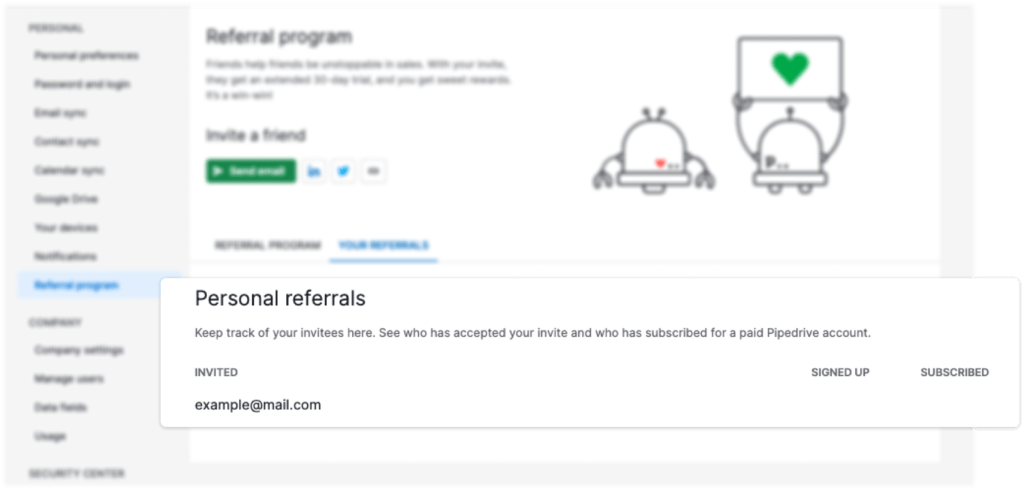
Having pre-written referral code copies available for sharing with friends is also beneficial. It may be useful to enable users to customize the copy for specific target groups, such as close friends versus those with loose connections in their network. In this way, users can maximize the effectiveness and impact of their referrals.
Evaluation
Remote
Remote is a leading platform for managing payroll, benefits, taxes, and compliance for international employees.
How it works
To participate in the referral program, a referrer either needs to be a paid user of Remote or can just sign up through the referral program portal. By sharing a unique referral link with peers and friends, the referrer receives a reward upon successful registration.

What we like
The user is informed about the new referral program through the “new” notification icon and can access the program through different touchpoints (portal and mail).
The program overview page includes all important information and provides a step-by-step guide to get started and a detailed FAQ.
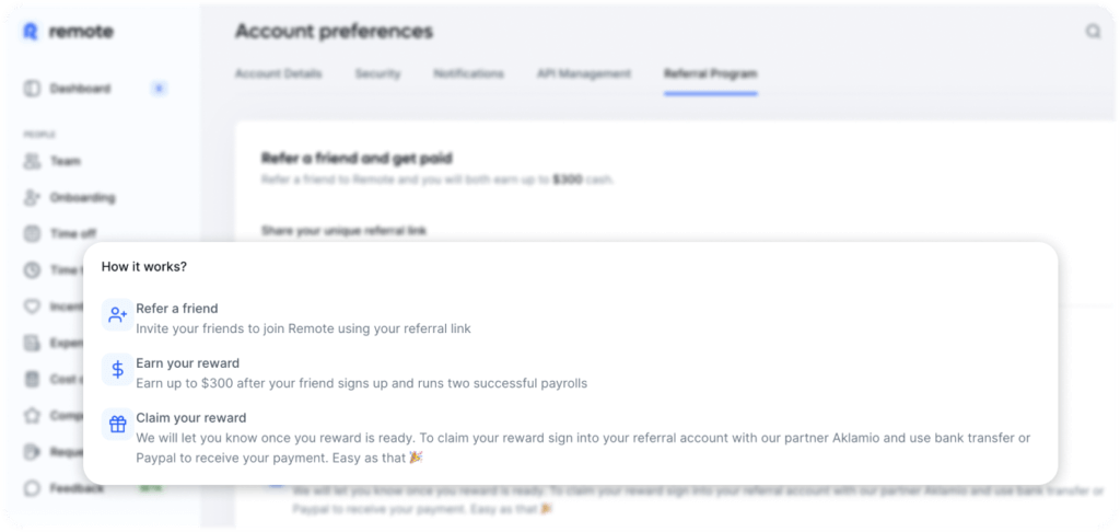
The referral program incentivizes both the referrer and the referee with a cash payout. Creating a relevant reward experience for both parties is a good idea but may also pose some risks if certain precautions are not applied (see the Improvement section).
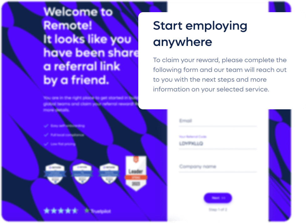
The landing page is well-structured and clean, with many trust signals that can help to convince potential referrers to participate in the program. To be even more effective, it is recommendable to communicate the potential reward for the referee (e.g. $300).
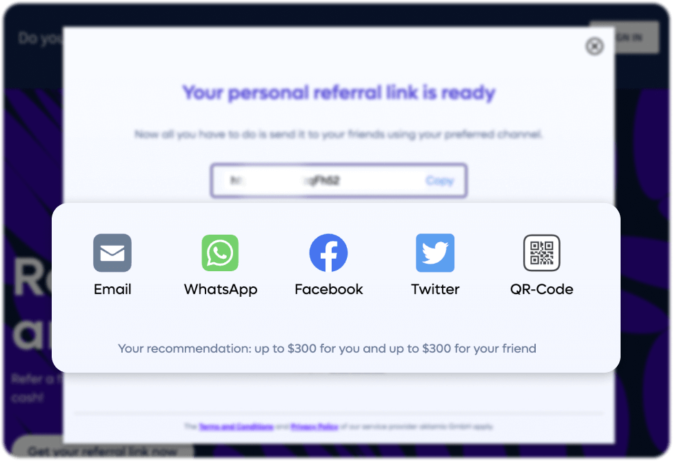
Even though a user needs to log-in a second time (s. potential improvements), the referral portal provides a great overview of the status of the referral, FAQs, and multiple sharing options.
What could be improved
When evaluating a referral program, one of the crucial factors to consider is the program's ease-of-use. Remote's referral program could benefit from some improvements, such as making it easier for users to find and participate in the program by moving the widget to the fixed sidebar or adding a floating action button.
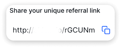
Moreover, the referral link provided by Remote lacks personalization and does not specify Remote. This obscurity can create confusion for users, which may hinder the effectiveness of the program.
Another potential challenge with Remote's referral program is that the referee is not informed that they can earn 300€. This lack of transparency might reduce the number of referred conversions.
Remote's referral portal enables non-paying users to participate in the program by creating and sharing an account with their network. While this ability could increase the program's reach, it raises concerns about potential confusion for referees and fraudulent behavior. For instance, a person may generate a referral link for themselves and unfairly benefit from a discount.
The portal also adds another burden. Paying Remote users need to log into the referral portal to claim their reward, but it is impossible to log in with Remote credentials. Thus, a separate account must be created, even with the same email, which creates confusion and an extra burden.
Evaluation
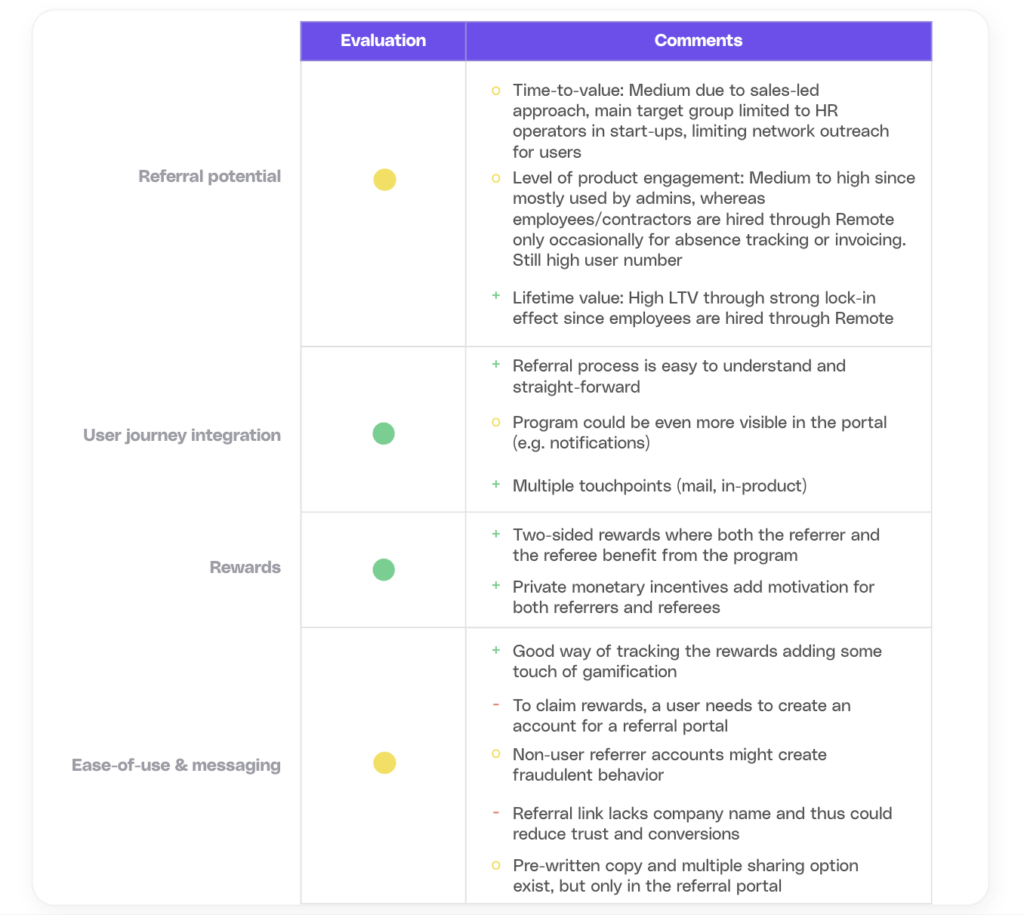
tl;dv (Powered by Cello)
tl;dv is an AI-based meeting recording tool.
How it works
To participate in the referral program, a referrer needs to open an account for TLDV and can access the program through the sidebar or a floating action button.

What we like
The referral program is prominently featured on the menu bar of the homepage, underscoring its importance. It provides a comprehensive overview of reward types, levels and participation options. Referrers can share their referral link through their social networks, accruing rewards from impressions. Alternatively, they can use the referral widget within the tool as a referrer.
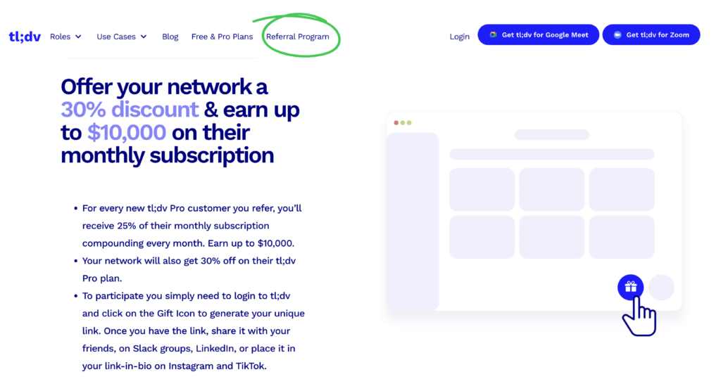
Upon accessing the TLDV platform, the program is easily discoverable either in the sidebar or as a floating action button, providing users with more chances to come across it. This increases the likelihood of program interaction and use.
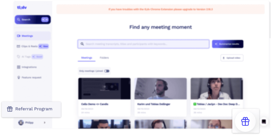
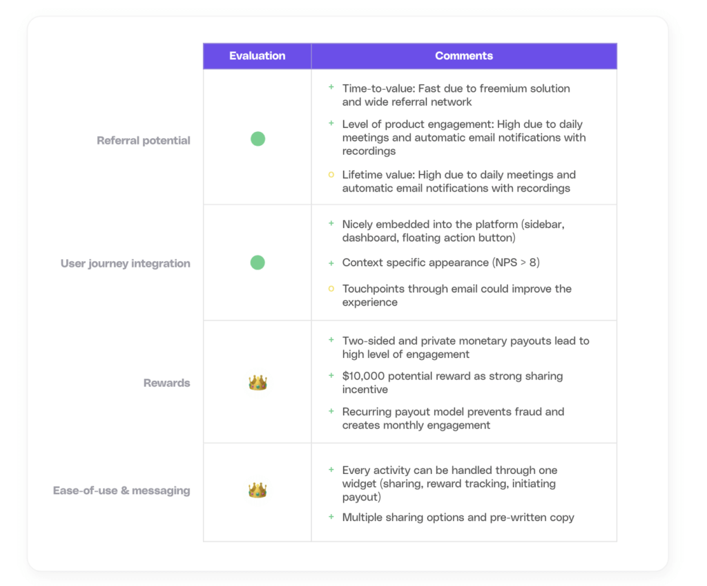
Clicking on the gift icon opens a user-friendly widget that condenses the most important information, such as the reward level and type. The double-ended reward system offers recurring monetary benefits to the referrer and discounts on monthly subscriptions to the referee, thereby improving the likelihood of conversions. The $10,000 possible reward is a strong hook for potential referrers. What is even more exciting is the recurring rewarding model, which prevents fraud and keeps referrers engaged.
Apart from traditional sharing options, such as Twitter, LinkedIn, and email, referrers can scan a QR code to share the link and copy directly with friends and peers via WhatsApp or Slack.
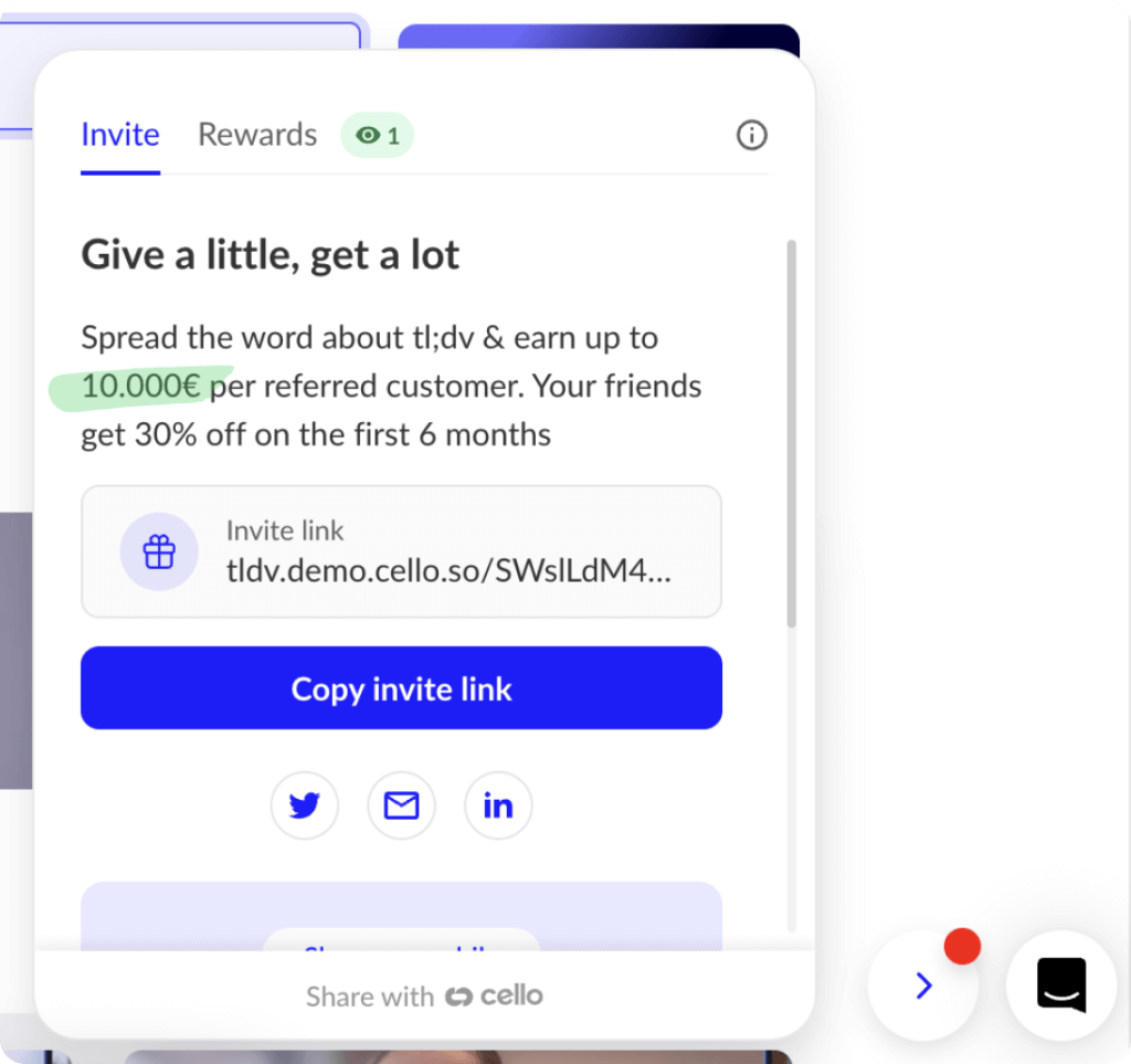
We also appreciate the landing page that appears when a referee clicks on the referral link. The overview page presents the tool's value proposition and discount options in a clear and concise manner.

Evaluation
Key takeaways on B2B referral programs
The B2B referral program examples analyzed above demonstrate that a successful, high-performing program, benefiting all involved parties (referrers, referees, and growth managers), requires a thoughtful approach to key factors.
Product Referral Program Fit: The ideal product has a large user base and active referrers. Users should have access to a wide network that can benefit from the tool. Providing a quick time-to-value, e.g. through a freemium or free trial motion, and promoting high product engagement through daily usage drive the success of a B2B referral program.
User Journey Integration: Integrate the referral program seamlessly into the user flow across different touchpoints, including portals, social media, and emails. Capitalize on happy customer moments, such as using notification banners, to encourage referrals.
Rewards: Offering personal and attractive incentives that are fulfilled in a timely manner amplify conversion rates. Gamification elements with transparent tracking and reporting enhance engagements.
Ease of Use & Messaging: The referral process is straight-forward and it’s easy for users to get started and share the tool with peers and friends. Providing personalized pre-written messages, multiple sharing options and individualized landing pages will facilitate the sharing.
How to get started with B2B SaaS Referral programs?
Cello was born from the realization that outside of costly self-building, there were no off-the-shelf tools available for B2B SaaS companies to invest in amplifying their word-of-mouth. Let us help you to launch your own program or improve your existing one. To get started quickly we collaborated with growth enthusiast Kyle Poyar and developed a step-by-step guide on building, launching and scaling a B2B SaaS referral program. If you already have one in place and want to benchmark it, go check out our article on B2B referral program KPIs and Benchmarks.
If you're interested in a referral program teardown yourself and inclusion on the mentioned page, just get in touch with us.
Resources
Related articles

A RevOps Guide to Integrating Cello Referrals with Salesforce Apex Triggers (2026)
TL;DR A RevOps Guide to Integrating Cello Referrals with Salesforce Apex Triggers (2026) Most ...

The Best Referral Software with Native SaaS Integration (2026 Deep Dive)
Your referral program lives or dies on one thing: whether users can share without leaving your ...

How to Add a Referral Program to Your React App (2026)
TL;DR Adding a referral program to a React application takes 3–4 hours of frontend work when ...
