Intro
The first chapter of the Guide to B2B User Referrals 2.0 was all about different GTM strategies and the potential power of user-led growth. In this consecutive chapter, we teamed up with Aakash Gupta (ex-VP Product @ Apollo & Epic Games), a leading product & UX operator legend, podcaster, and content creator with over a decade of experience in creating intuitive digital experiences for top tech companies. In co-creation with Aakash, we dig deep into the importance of seamless UX for high-performing referral programs.
“Design is not just what it looks like and feels like. Design is how it works.” (Steve Jobs)
This quote from Steve Jobs underscores a key truth about UX: it's not just about aesthetics but creating seamless, functional user interactions.
In SaaS, UX is a crucial driver of product adoption and customer satisfaction. A Forrester study shows that a well-designed user interface can boost conversion rates by 200%, while seamless UX can increase rates by up to 400% (source). Adobe reports that companies prioritizing UX are three times more likely to meet business goals (source).
Referral programs, as extensions of your product, depend heavily on UX. Even generous incentives can fail if the user experience is lacking. A well-designed referral program encourages engagement, while a poor one can lead to frustration and low shareability.
What will you learn?
- What are UX and design principles for product development?
- What are the challenges of current referral program implementations?
- Where could and should you integrate your referral program?
- Why and how should you make sharing a breeze?
- How can you build a habit of sharing?
- How can you increase the activation and sharing rate of your referral program?
- What does a great referral program UX look like?
Theoretical background on UX & design and its impact on product adoption
Before exploring UX challenges and opportunities for improving discoverability, sharing rates, and continuous engagement of user referral programs, let's examine the underlying design concepts and theories.
The essence of UX
Utility, usability, and value UX is about more than just aesthetics; it’s about creating useful, usable, and valuable solutions to users.
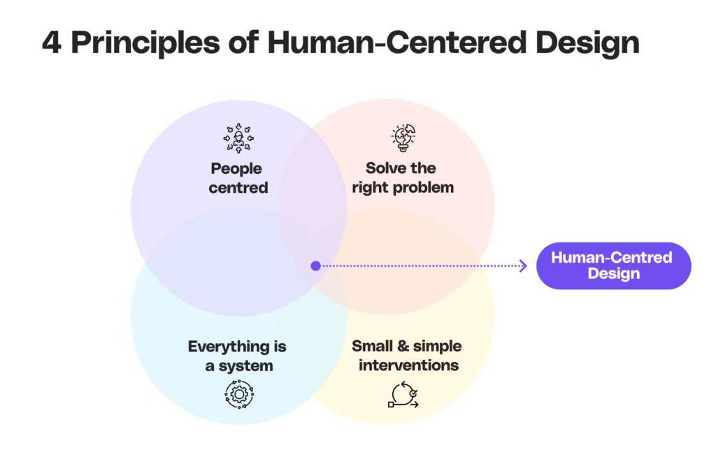
Don Norman’s Human-Centered Design emphasizes that products should be intuitive and minimize user friction, which is critical for positive user perception and adoption.
The impact of UX on product adoption
Prioritizing UX can significantly enhance product adoption.
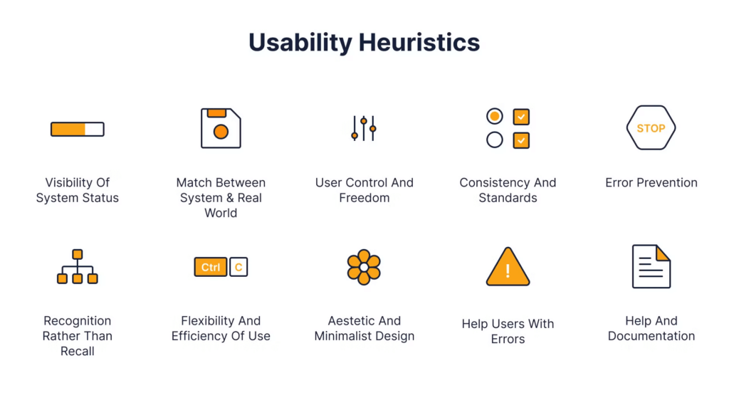
Jakob Nielsen’s Usability Heuristics highlight the importance of consistency, error prevention, and clear communication. These help users navigate and find value in a product, leading to higher adoption rates.
UX vs. UI: Understanding the Difference
While UI design focuses on aesthetics, UX encompasses the entire user experience, from functionality to emotional impact.
Peter Morville’s UX Honeycomb outlines that a successful product must be useful, usable, desirable, and credible, among other factors.

Benefits of prioritizing UX
By focusing on UX, businesses can attract more users, increase retention, and drive revenue. Well-designed UX leads to better conversion rates and fosters long-term customer loyalty, making it a key driver of product adoption and overall business success.
Now that we understand the importance of UX and UI, a question arises: why do many referral programs fail to follow UX best practices? Let's examine some common challenges.
Challenges of referral programs when it comes to UX
Designing an effective referral program requires overcoming several UX challenges hindering user engagement and participation. Here’s a brief overview of the key issues we see throughout the market:
- Buried programs: Referral programs are often hidden, leading to low visibility and poor activation rates.
- Separate logins: Requiring users to log in outside the product disrupts the user flow and deters participation.
- Lack of notifications: Users may forget about the program without regular updates, reducing engagement and picking up rewards. Providing real-time feedback on referral progress for the referrer allows to follow-up if things get stuck, ensuring consistent engagement.
- Inconsistent branding: A referral program that doesn’t match the product’s brand creates a disjointed user experience and can harm brand perception.
- Missing external communication: Not using emails or other external channels limits the program’s reach and user engagement.
- Missing mobile integration (where possible)
A common issue is that referral programs are often poorly designed from the user's perspective. This can stem from using third-party tools that aren't natively integrated or in-house solutions that don't receive the same attention as core product features.
This leads to low discoverability, low engagement, and eventually, low performance of the program.
Let’s examine what this means for referral programs and how best-in-class UX can positively impact their performance. We will look at three crucial elements of successful referral programs:
- Program discoverability
- Ease of sharing
- Continuous engagement
Program discoverability
Embedding your referral program alongside your customer journey for maximum discoverability and ease of sharing is crucial.
Provide referral links across multiple touchpoints inside (e.g. sidebar navigation, end of core flows, user profile) and outside your UI (e.g. emails).
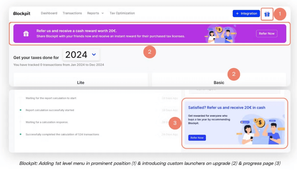
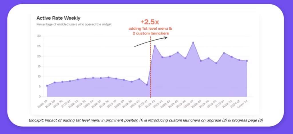
Usually, a first-level integration in a menu or a floating action button (FAB) results in significantly higher activation rates. For example, Blockpit added first-level actions alongside a second-level menu integration, increasing its weekly referrer activation rate by 253%!
Let’s have a deep dive.
Various referral program launchers
How do companies embed their referral program?
Before we dive into impact metrics of various launcher, let’s have a look where companies generally place their referral program.
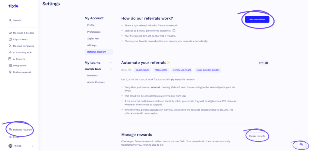
- First-Level menu integration launcher: Companies place the referral program directly in the main navigation menu for easy access and visibility. Best implementations are in the vertical sidebar with (1) text (e.g. “referral program”) and and (2) indication about the referral reward.
- Dashboard banner: A prominent banner within the app (at the home screen) promotes the referral program, encouraging user interaction. The banner can be either always visible or pop up at moments of delight (we touch on this further below).
- In-App Launcher: The referral program is embedded within the app's user interface and is accessible during regular user activities.
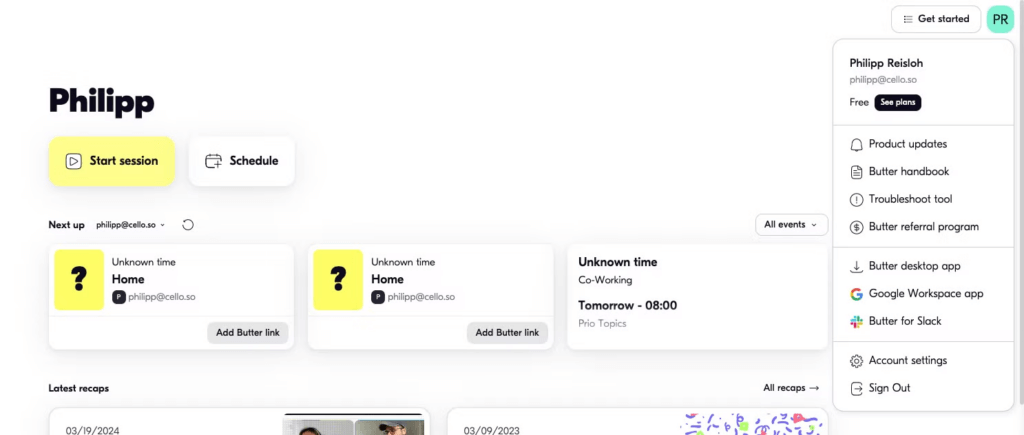
- Second-Level Menu Launcher: The referral program is nested within a sub-menu, making it accessible but less prominent than first-level placements.
- Floating Action Buttion (FAB): The referral program is nested within a floating action button. Similar to the helpdesk/ chat button (e.g. Intercom), a simple gift icon can prominently promote the referral program.
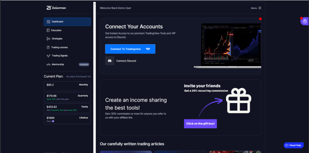
Let’s now look at Cello's proprietary data (from >4M referral users), see what launcher performs best, and identify some more key drivers to increase discoverability.
Key drivers to increase discoverability
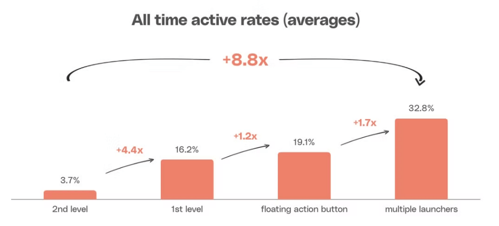
The below graphic shows the impact on referral program discoverability with various different launchers, and placements.

Don't limit your referral program to a second-level menu, which typically results in the lowest activation rates. Instead, prioritize first-level menu integration and strategically place access points throughout the user journey.
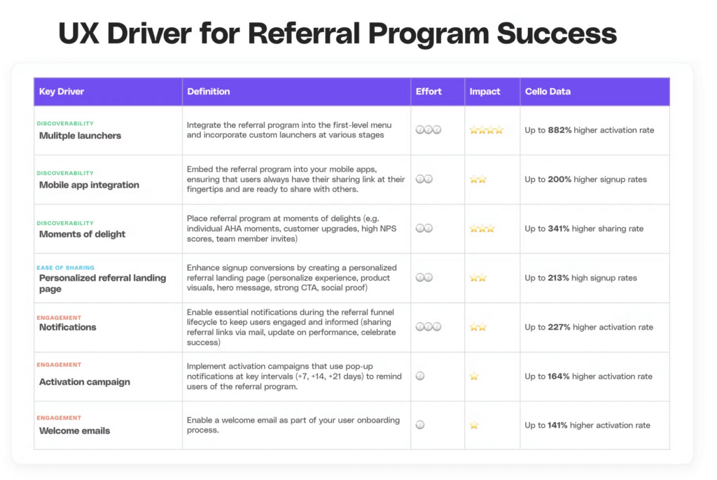
Key driver #1 : 1st level menu integration + custom launchers
- What: Increase the visibility and discoverability of your referral program by strategically placing multiple launchers across key touchpoints in the user journey.
- How: Integrate the referral program into the first-level menu and incorporate custom launchers at various stages, ensuring users encounter the program naturally and frequently as they navigate your product.
- Why: Up to an 882% higher activation rate.
Key driver #2 : Mobile app integration
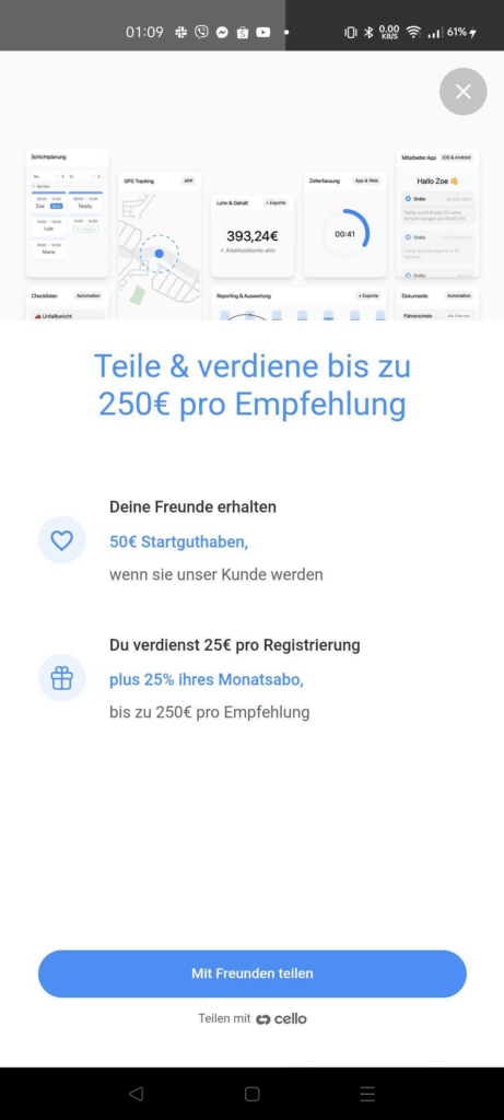
- What: Enable seamless sharing within your mobile apps by integrating your referral program directly into the app experience.
- How: Embed the referral program into your mobile apps, ensuring that users always have their sharing link at their fingertips and are ready to share with others.
- Why: Up to a 200% higher signup rate, as users are more likely to share when the process is convenient and readily available within the app.
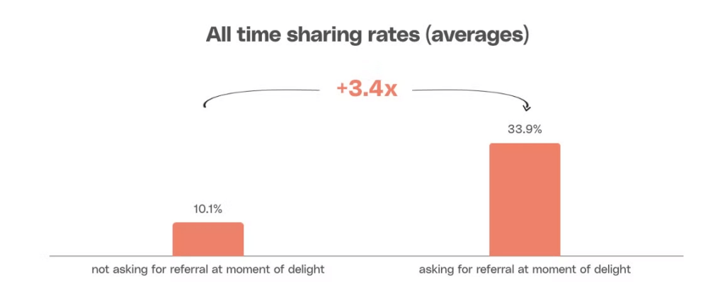
Key-Driver #3 : Moments of delights
- What: Ask for a referral during moments of delight - those times when users experience significant satisfaction or value from your product.
- How: These moments of delight can be identified through key milestones in the user journey, such as:
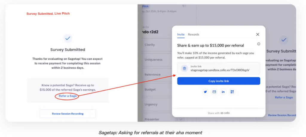
- Individual AHA Moments: When users experience a breakthrough, such as sharing their first project, saving costs for the first time, or recording their first meeting, they are more likely to feel positive about the product and share it with others.
- Customer Upgrade: When a customer upgrades to a higher plan, it indicates a strong commitment and satisfaction with the product, making it an ideal time to request a referral.
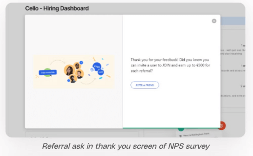
- High NPS Scores: If a customer gives a Net Promoter Score (NPS) of 8 or higher, it signals they are highly satisfied and more likely to recommend the product.
- Team Member Invitations: When users invite team members to join the product, they are already engaging in a form of referral, making this a natural point to encourage further sharing.
- Why: Up to 341% higher than the average sharing rate
Ease of sharing & signing up
The easier it is for your users to share your tool with peers, the more likely they will recommend your product.
The easier it is for new users to understand your value proposition and test your product, the more likely they will start using your solution.
Ease of sharing
Simplicity for referrers & referees
Reducing friction in the referral process is crucial for both referrers and referees. The easier it is to share and accept referrals, the higher the activation and sign-up rates. A seamless experience with minimal steps ensures users can quickly and effortlessly share your product.
This includes:
- Clear Value Proposition: Ensure users can quickly grasp the benefits of participating.
- Multiple Channel Support: Allow users to share via various channels, such as mobile, social media, or QR codes.
- Seamless Experience: Users should be able to share without leaving the program or needing an extra sign-up.
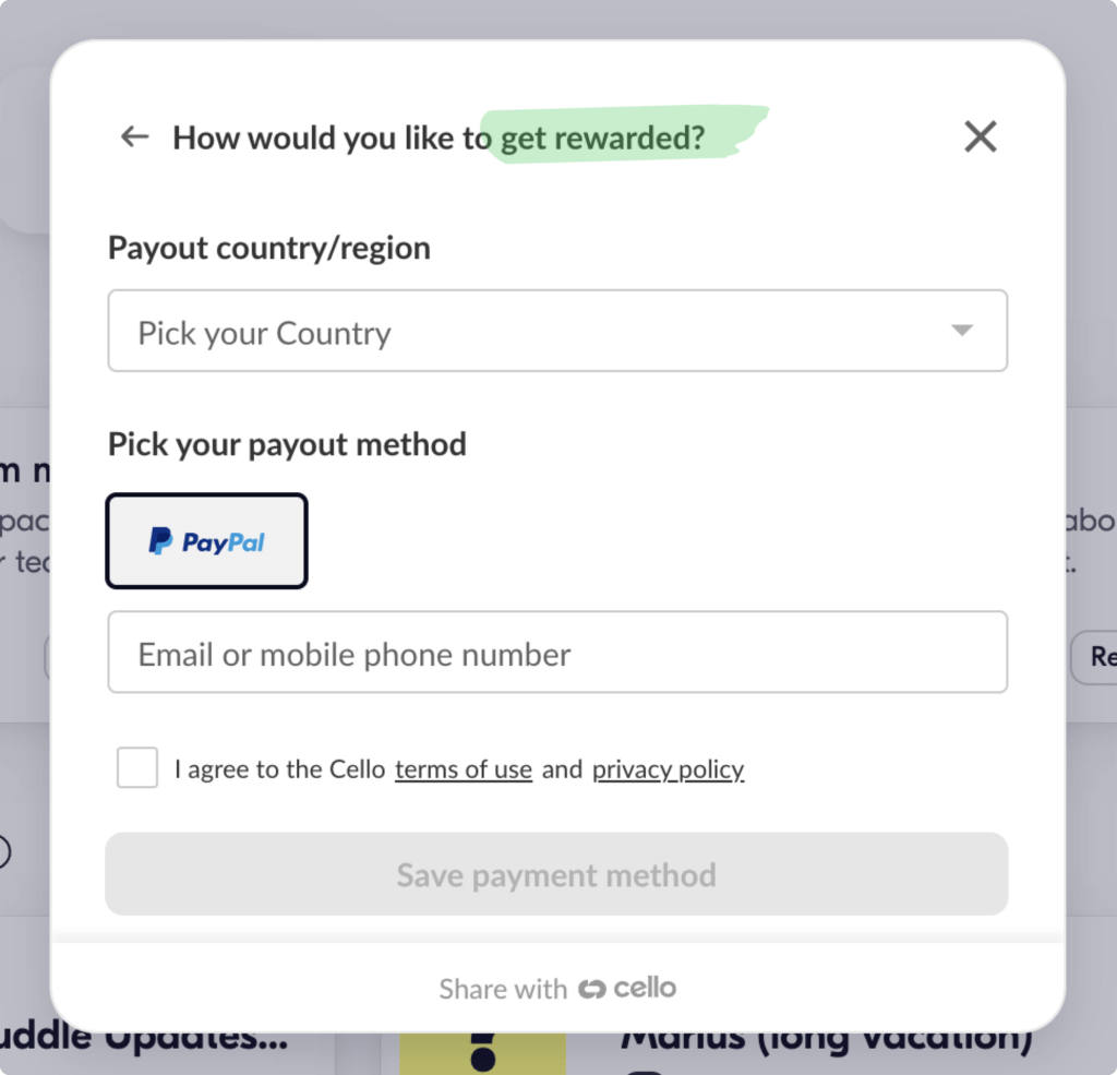
- Simple Payment Process: Make it easy to get paid, such as by just entering PayPal details.
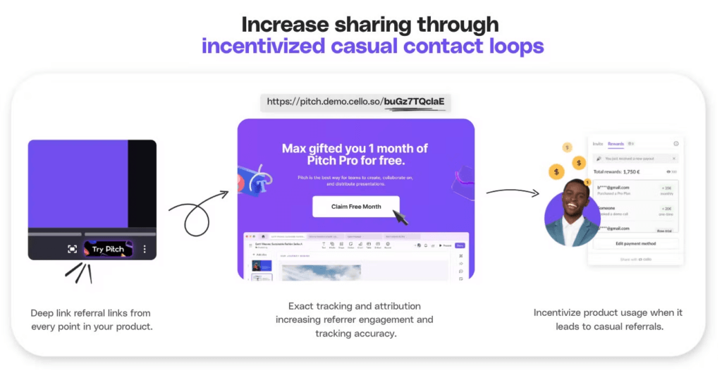
- Incentivized casual contact loop (ICCL): The ultimate way to make life easy for referrer. Just make sharing the referral program part of their normal work routines of e.g. sharing meeting minutes with customers becomes referral actions.
- BONUS - AI identification of recipients: Suggesting persons from the user’s network share the tool to take different data points into account (title, company, etc.)
By decreasing friction and making the process as smooth as possible, you increase the likelihood that users will engage with and promote your referral program, ultimately driving more successful referrals.
Provision of Templates and Resources
Offering resources like copy templates, GIFs, and video explainers can significantly simplify the sharing process. These assets make it easy for users to spread the word without needing to create their own content. Many successful referral programs even feature dedicated landing pages with FAQs and resource libraries to support users. For example, some platforms, like Gusto, go a step further by scanning contacts and recommending leads that match the ideal customer profile (ICP), which enhances the relevance of referrals.
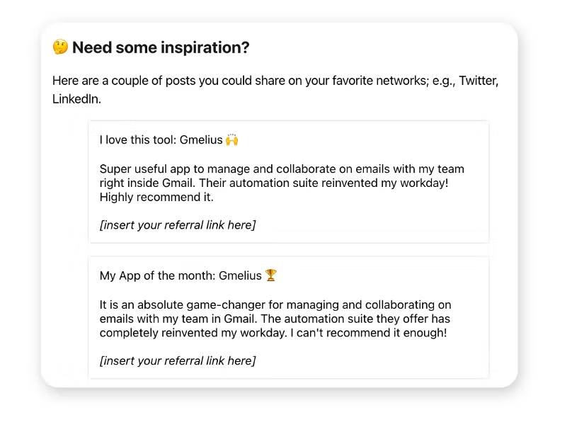
Key Driver to increase sharing
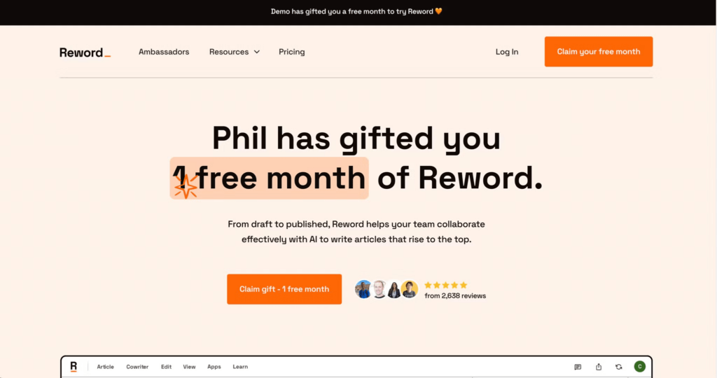
Key-Driver #4 : Personalized referral landing page
- What: Enhance signup conversions by creating a personalized referral landing page tailored to the needs and expectations of new users leveraging social proof.
- How:
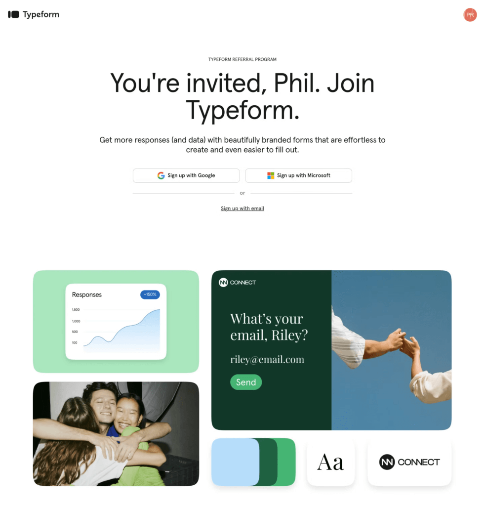
- Personalize the experience: Display the referrer’s name on the landing page to create a sense of trust and connection.
- Clear new user discount: Clearly state any discounts available for new users to encourage quicker conversions.
- Hero message: Communicate the key value proposition of your tool prominently to capture the interest of referred users.
- Product visuals: Use visuals to highlight and explain your product's core benefits, making it easier for new users to understand its value.
- Strong CTA: Include a direct signup call-to-action for referred users to facilitate a smooth transition into your product.
- Social proof: Add credibility with badges from G2, Capterra, Trustpilot, customer logos, and quotes to build trust.
- FAQs: Provide answers to common questions that new leads might have, reducing uncertainty and barriers to signup.
- Why: Up to 213% higher signup rates
Continuous engagement
Effectively timing and engaging users in your referral program is key to maximizing its success and creating exponential growth loops. Here's how to optimize this process:
- Capitalize on positive psychology:
Surface the referral link immediately after users complete valuable actions to leverage positive experiences and encourage sharing. - Timely nudges for continued engagement:
Pair in-product referral prompts with well-timed email or push notifications to keep the referral process top of mind. - Balance discoverability and core experience:
Ensure referral options are easy to find without distracting users from the main purpose of your product. - Use gamification to drive conversions:
Incorporate elements like leaderboards and competitive messaging to boost user motivation for sharing. - Provide real-time feedback:
Offer real-time updates on the status of sent-out referral links, both within the product and externally. - Nudge referrers for follow-up:
Send reminders to referrers if their invitee hasn’t signed up after a set period, encouraging them to follow up and complete the referral.
Key driver to keep continuous engagement
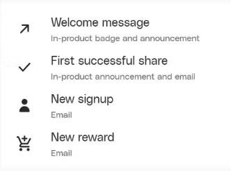
Key-Driver #5 : Notifications
- What: Enable essential notifications during the referral funnel lifecycle to keep users engaged and informed.
- How:
- Share referral links via email: Provide users with referral links in emails that they can easily forward to their network, simplifying the sharing process.
- Update referrers on performance: Keep referrers informed about the performance of their referral links outside the product, which helps maintain their engagement and motivation.
- Celebrate success: Recognize and celebrate successful referrals with referrers, encouraging them to continue sharing.
- Why: Up to a 227% higher activation rate

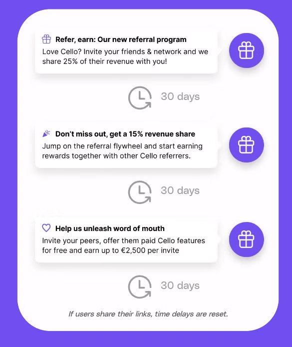
Key-Driver #6 : Activation campaign
- What: Implement activation campaigns that use pop-up notifications at key intervals (+7, +14, +21 days) to remind users of the referral program.
- How: Integrate these notifications strategically across the user journey to maintain visibility and awareness without disrupting the user experience.
- Why: Up to a 164% higher activation rate
Key-Driver #7 : Welcome emails
- What: Enable a welcome email as part of your user onboarding process.
- How: Send a welcome email to new users 7 days after their first login, reinforcing their decision to use your tool and introducing them to key features.
- Why: Up to a 141% higher activation rate
To conclude this chapter and offer some inspiration, let's have a look at a summary of all above listed measures and examine an exemplary UX flow of a cutting-edge referral program.
What good looks like
The graphic below summarizes the impact of various UX key drivers. It's best to implement a combination of these strategies for optimal results.
Let's see how this translates into a potential UX flow below.
- Multiple Launcher Integration
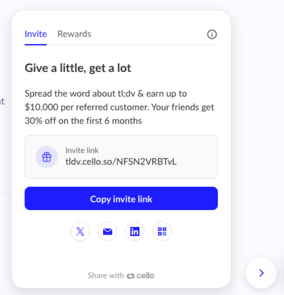
2. Focus on the value proposition of the referral program and offer various easy-to-use ways of sharing
3. Personalize the referee landing page and stress the benefits of the tooling
4. Inform the referrer of the status of the referral (in-app or via email notifications)
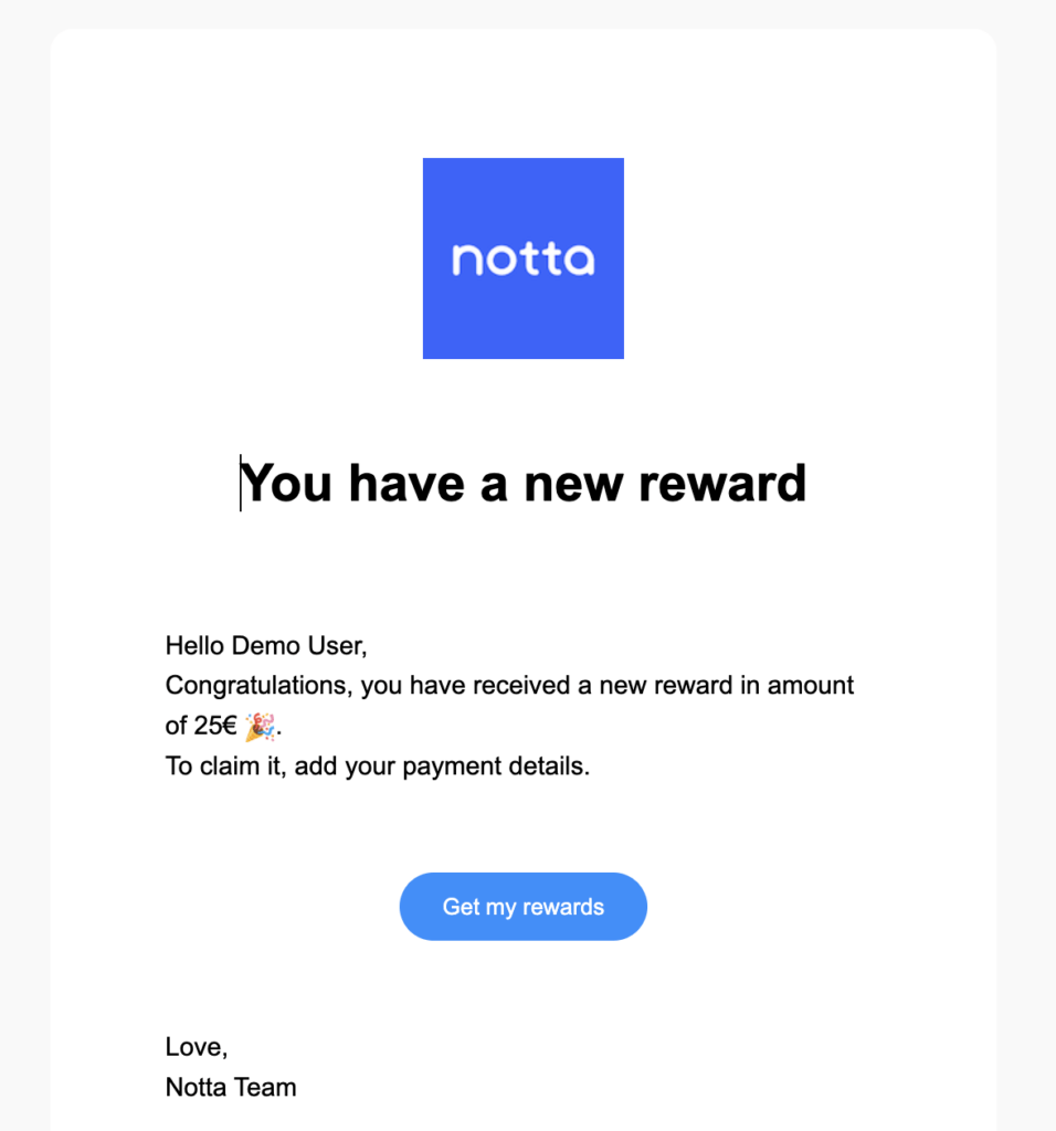
5. Continously engage with the referrer (via notifications) and show status and earned rewards

6. Provide an easy way to get paid out incl. tax, legal & KYC compliance
Conclusion
In the fast-paced world of SaaS, a well-designed referral program is more than just an add-on; it’s a strategic extension of your product that can compound to drive significant growth. By prioritizing UX, you ensure that your referral program is easy to find and deeply integrated into the user journey, maximizing its impact.
From high discoverability through first-level menu integrations to personalized landing pages and timely notifications, each element of your referral program should be crafted with the user’s experience in mind. This focus on seamless interactions and strategic touchpoints can dramatically increase activation rates, signup conversions, and continuous engagement, leading to higher participation and greater success.
Remember, the effectiveness of your referral program hinges on reducing friction, enhancing visibility, and tapping into the right moments to ask for referrals. By applying these principles, you can create a referral experience that feels natural, rewarding, and, most importantly, effective in turning satisfied users into enthusiastic advocates.
Resources
Related Articles

Complete Guide to your Affiliate Program for B2B SaaS
Learn how to get started with affiliate referral programs for B2B SaaS. Understand if affiliate ...

The Ultimate Guide to B2B Influencer Referral Programs
Discover actionable tips & the complete process to launch your own influencer referral program

The untapped channel across GTM strategies for B2B SaaS: User Referrals
Discover actionable tips & the complete process to launch your own influencer referral program

